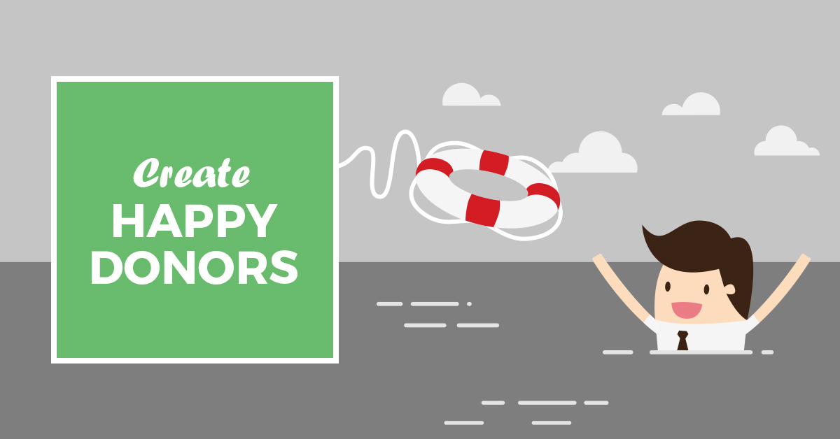
How to Turn Failed Transactions into Happy Donors
The Transaction Failed page is not one you want people to see. But if they do, you want to make it the best experience possible. This article will walk you through the process of turning even your failed transactions into happy donors, as quickly as possible. Upon installation, Give adds a new page to your…
The Transaction Failed page is not one you want people to see. But if they do, you want to make it the best experience possible.
This article will walk you through the process of turning even your failed transactions into happy donors, as quickly as possible.
Upon installation, Give adds a new page to your site named “Transaction Failed” with the text “We’re sorry, your transaction failed to process. Please try again or contact site support.”
While this is helpful for a potential donor to know that their transaction did not properly process, with a little extra massaging, this page can go from “sad trombone” to “encouraging help” for donors.
Before you do anything, realize who you are talking to on this page. With our article on the Thank You page, we helped you maximize the effectiveness of the Donation Confirmation page. Your Transaction Failed page is a chance to get the donor to that “Thank You!”
Who is Your Audience?
The only people who will ever see this page are folks who have already clicked a button saying “Donate Now.” So, no need to sell them on why to donate, or other causes to donate to, or any of that. You entire goal is to get them back to that “Donate Now” button armed with the tools to get successfully back through the transaction.
With that knowledge, your tone on this page should be that of a support tech looking over their shoulder walking them through a proper transaction. You aren’t in sales here, you’re in support. The faster you fix the problem, the better your donor’s experience will be.
On your Transaction Failed page, you’re not in “sales mode.” You’re in support mode.
Think of this page like documentation for one very specific problem. Give the user screenshots, different troubleshooting steps, and a direct way to contact someone to help them if at all possible.
What do they need?
The copy on this page should not be cutesy or fun, but direct, friendly, reassuring, and helpful. Treat the user like someone who just stubbed their toe, but still needs to make it to their flight on time.
Direct: Let them know immediately that their donation did not go through, and that they need to resubmit it.
Friendly: If you’ve tested your donation forms and are relatively certain the problem is on the donor’s end, now is not the time to harp on that point.
Reassuring: “We’ve extensively tested these donation forms, but sometimes a new incompatibility or issue may show up. Can you help us figure it out by _____?”
Helpful: Go as far as your organization is able, here. If you regain three donors per month by putting your mobile phone number on this page, would it be worth it? Going all-out to help donors on the cusp of donating will go a long way toward increasing donation revenue.
Need more?
For more tips on the Transaction Failed page, see our documentation.
For the developers out there: if you want to conditionally direct your donors to different Transaction Failed pages based on the Form ID, try this snippet:
Conditional Failed Transaction Page
About the Author
Ben Meredith
Ben Meredith is our Head of Support at GiveWP. He’s also the founder of The WP Steward and the author of the popular Better Click To Tweet Plugin.