Reports Overview
The Overview tab has multiple sections that can be used to give you a sweeping view of how your donation forms are performing. Parse your timeframe by day, week, month, year, or custom. See performance metrics about donations, revenue, donors, payment gateways, and more.
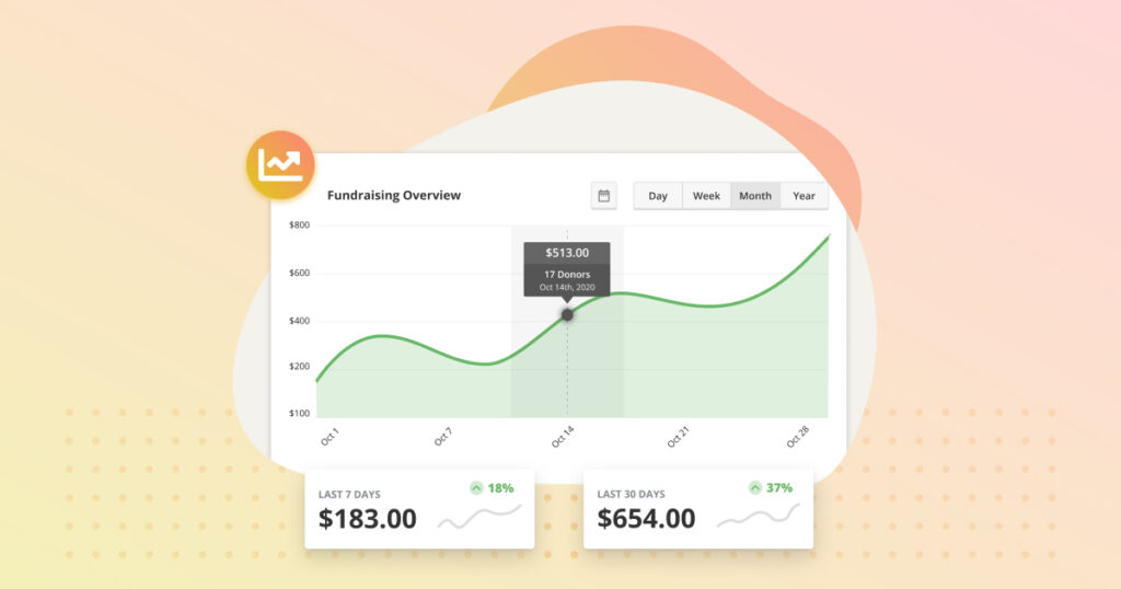
Income for Period Chart
The first section on this tab is a line graph showing your site-wide income for the period of time you select. Each data point on the graph shows the amount of money earned and the number of donations you had through your site.
Just above the chart is the date range selector. You can choose a custom date range, or choose to view the data range by daily, weekly, monthly, or yearly increments. The date range you choose applies to all the charts, graphics and lists on the page.
Note: The revenue for a Period uses the timestamp for donations in the Complete status. This means the report may display donations that were actually submitted in a previous time period.
Mini-Charts
Total Income
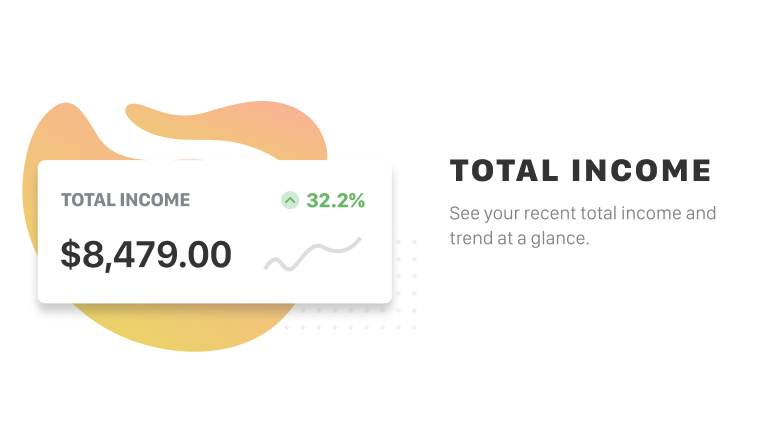
The total income chart displays the total income that your site earned through donations in the period of time you selected. It also shows the current trend of income. This is useful to see if the amount you’ve been raising has been rising or falling over time.
Average Donation
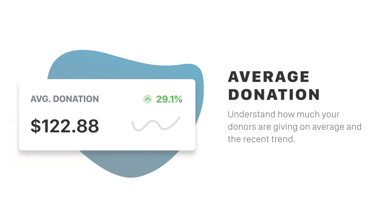
The average donation chart displays the average donation amount you received within the period of time you selected. It also shows the current trend in average donation amount. This is useful to see if on average your donations have been rising or falling for a particular interval.
Total Donors
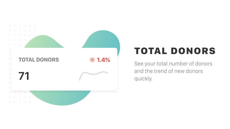
The total donors chart displays the total number of individual donors who have donated within the period of time you selected. It also shows the current trend in donor count. This is useful to see if you have been increasing or decreasing the amount of new donors who have been donating through your site.
Total Refunds
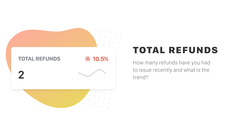
The total refunds chart displays the total number of refunds you’ve delivered to donors within the period of time you selected. It does not show the amount of money that has been refunded. It also shows the current trend in refunds. This is useful to compare the number of times you’ve needed to process a refund within the time period you set.
Reports take into account all kinds of donations, but totals only reflect donations that have been marked as Complete by the gateway, or manually changed to Complete in GiveWP.
Revenue Breakdown

The Revenue Breakdown chart displays your latest donations sorted by date. You can see the number of donors, any refunds, and the net amount earned. Use the Export CSV button to export this data.
Performance Charts
Payment Methods
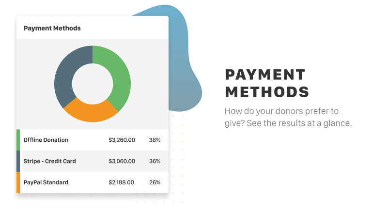
The payment methods doughnut chart displays the popularity of different payment methods for the period of time you set. It shows the top 4 payment methods, then “Other.” Each gateway shows the number of donations you’ve received through those gateways, as well as the percentage they account for.
Payment Statuses
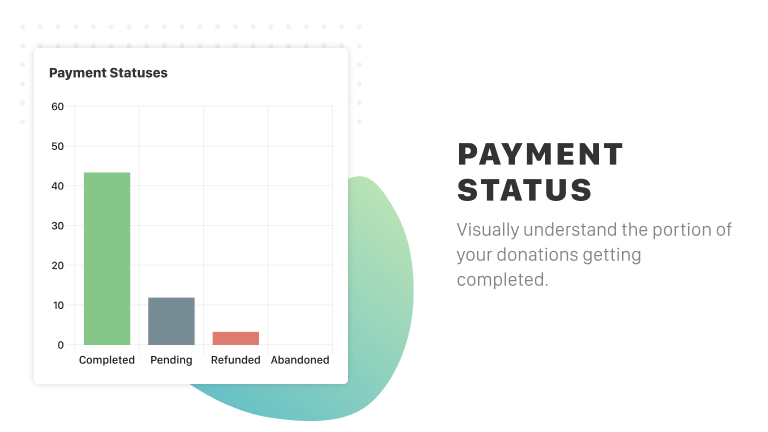
The payment status bar chart displays the current payment status counts for the period of time you set. It displays the number of Completed, Abandoned, Refunded and Cancelled donations currently logged on the website.
Form Performance
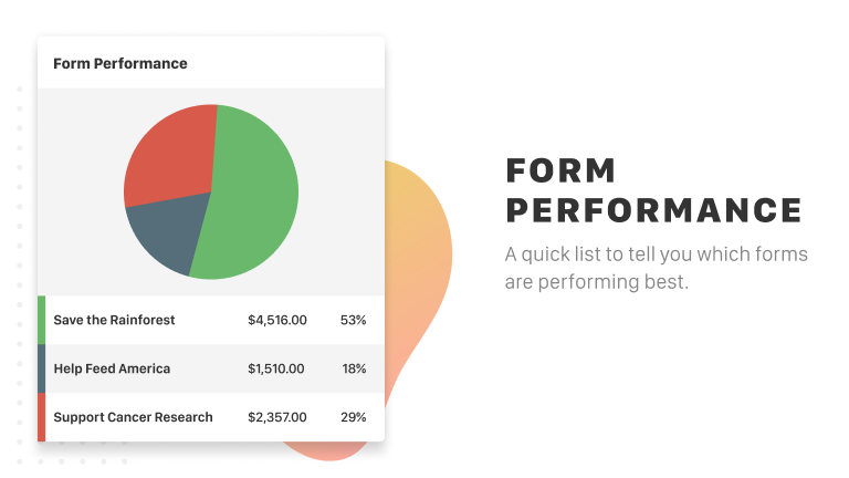
The top form performance pie chart shows which forms were used most within the period of time you set. Out of all the donations you’ve received, this chart shows which forms were used most, how many times they were used, and the percentage of total site-wide donations that form has raised.
Performance Lists
Donation Activity
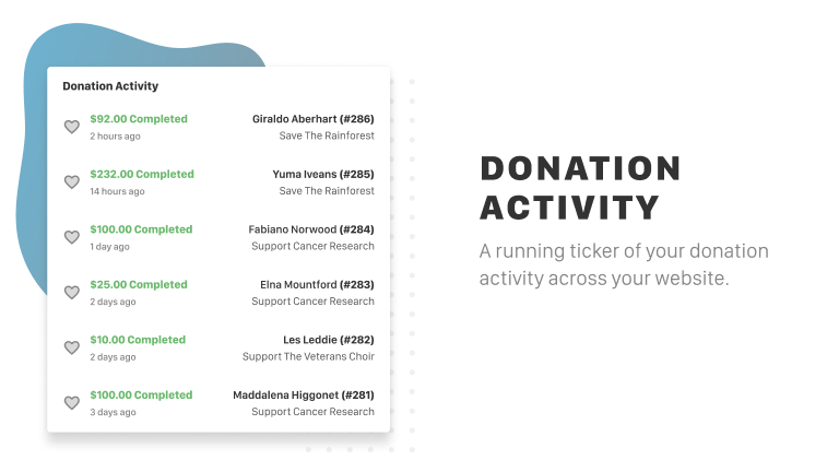
The recent donations list shows the most recent donations that have been successfully given through your website. The list shows:
- The name of the donor
- The donor ID
- Which form the donation came through
- When the donation occurred
- Whether or not it was recurring
Note that this list does change depending on the date range you select, and will then show the most recent donations within that range.
Top Donors
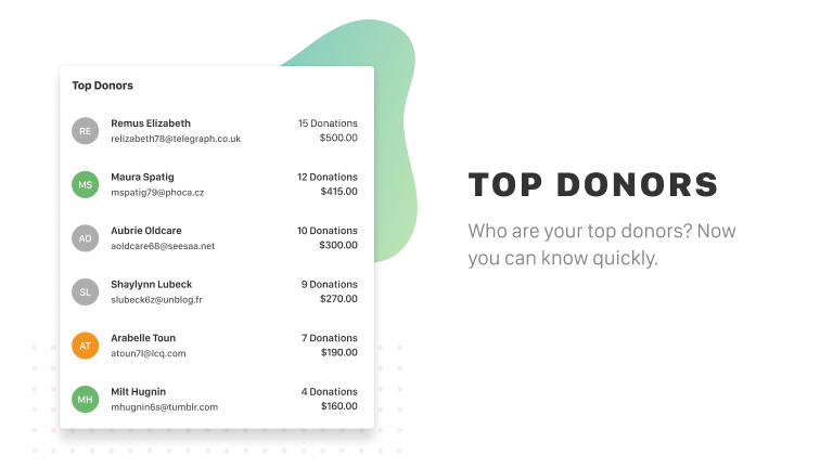
The top donors list shows the top 25 donors who have given the largest amount of money within the selected period of time. The list shows their name, email, how many donations they have given, and the total they have donated. It also shows a photo, which will pull from the Gravatar that the donor associated with their WordPress user account.