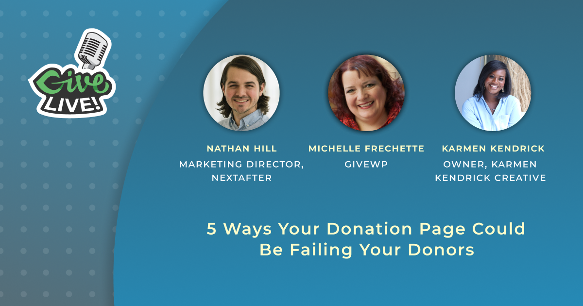
Give LIVE: 5 Ways Your Donation Page Could Be Failing Your Donors
We were live on April 14 with NextAfter to talk about how to fix the biggest mistakes your donation page can make.
Your donation page is the most important part of your website. All the messaging and storytelling in the world won’t matter if your donors don’t donate. We were live with Nathan Hill, Marketing Manager of NextAfter, to talk about how your donation page might be turning off your donors.
General Donation Page
There are different kinds of donation pages, but this conversation focuses on your general donation page. This page has to be the most universal because it converts donors of all kinds.
Experiment: Which main donation page design will lead to more donations?
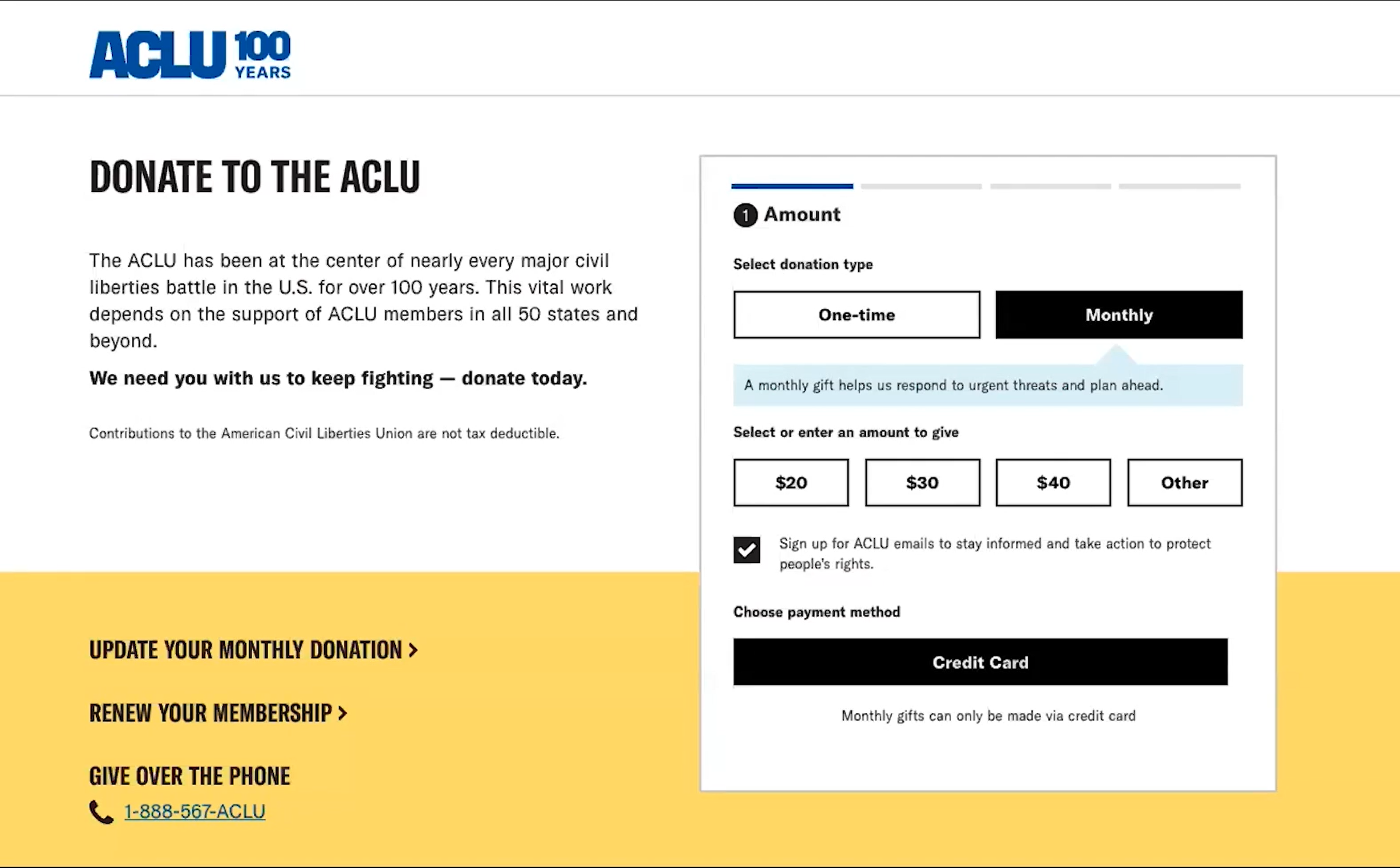
To start, think about these two donation pages. One has the form at the top, with minimal copy. The other has a few paragraphs before the donation form.
Which do you think performed better?
The page with more copy resulted in a 150% increase in donations. That’s 150% more people giving because of the messaging added to the top of the page.
“But wait… aren’t they already motivated to give?”
A person who visits your general donation page has the goal of giving, but they still have reasons to second guess their decision and turn back.
Adding copy to the top of the page increased donations because “it understood that the donor was not yet fully motivated to give.”
The donor comes to the page with the goal of giving, but there are still reasons to second-guess their decision and turn back.
This version won because it takes into account that the donor may not yet be fully motivated to give.
Friendraising vs Fundraising
This experiment reminds me of the concept of “Friendraising” vs “Fundraising.”
The original donation form is a little like someone walking up to you with their hand out, asking for money. You don’t know them so why would you give to them? Or maybe you know them, but you still don’t feel compelled to give to them.
Here, adding comment creates an element of conversation. So you’re talking to the donor about why they should give before you ask them to donate. It’s a better donor experience all around.
Donation Page Conversions are a Mountain
Leading a donor to give is a lot like leading them up a mountain. Nonprofit Marketers like to think of this as a funnel, but gravity (or friction) works in the opposite direction.
Before a donor gives, they have to say yes to a few things to get to the form and then they need to decide to give.
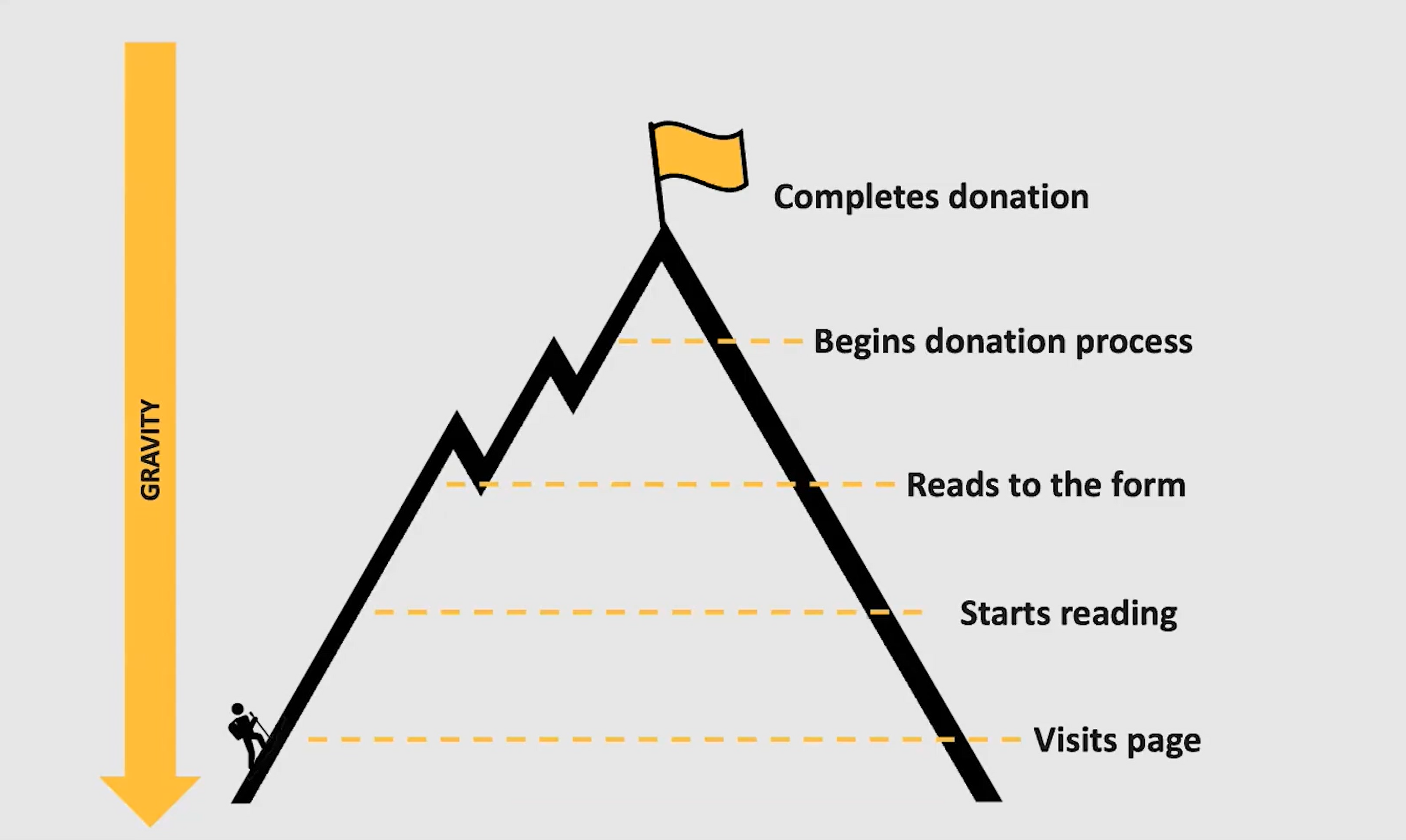
“It’s our job as a fundraiser to help the donor climb this mountain and make this donation.”
5 Areas Where We Often Fail Our Donors On Donation Pages
If you’re thinking of your general donation page only from your organization’s perspective, you will miss a few key things that donors need. Here are five ways you might be failing your donors.
Poor Messaging
Inclusive messaging is crucial to convert donors on your general donation page because the motivations of people landing here vary widely.
On this page, the copy should focus on reach and impact, or what the organization does as a whole. However, the phrasing needs to focus on your donor.
“Focus on what they can do, as opposed to what they can do through you.”
Distracted Donation Form Design
Your donation form landing page should be focused on giving. Keep other distractions out of the picture and lead donors through giving in a logical way.
One simple solution to keep distractions away from your general giving page is to disable the main navigation. NextAfter did a case study on this and found that it led to a 195% increase in donations.
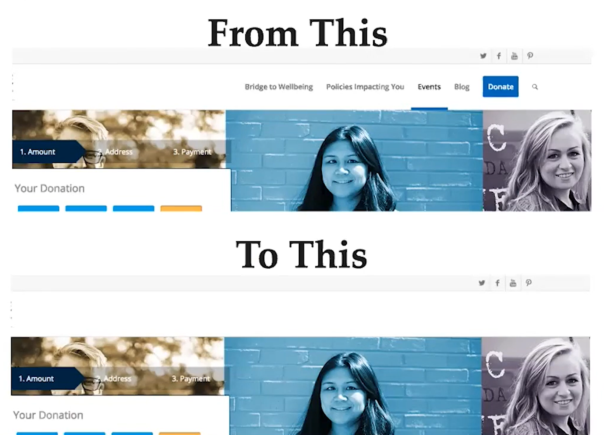
Another common mistake mentioned was to include an “other ways to give” section. Other ways to give should be placed elsewhere on your website. Once someone lands on a general giving page, the only call-to-action (CTA) should be to donate. If you give a donor a reason to hesitate, they will.
Think about your own donation pages. Are there distractions?
Awkward Donation Options
Choosing your donation options can get really complicated. We’ve talked a lot about how to select donation amounts in the past, but the main takeaway is that the optimal setup is different for everyone.
NextAfter has found that the core idea behind successful donation options is to avoid making them sound too transactional.
“We want the donor to be focused on the outcome of their giving as opposed to thinking about the transactional nature of a donation.”
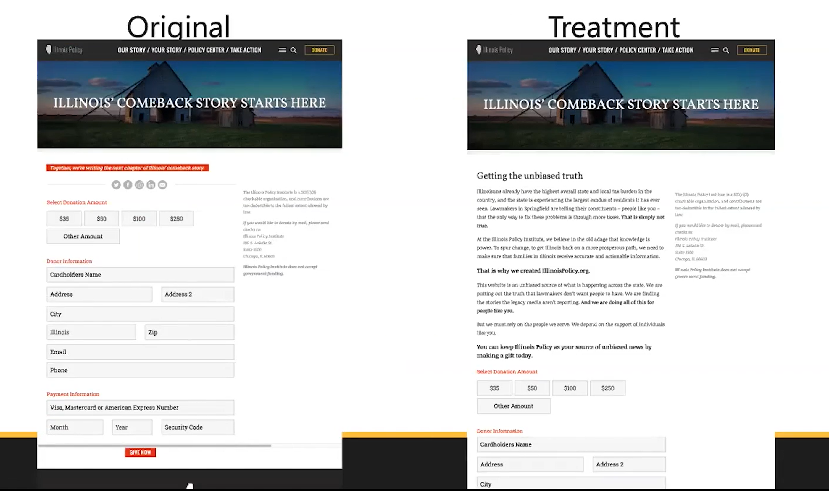
Too Much Perceived Personal Info
Make sure your forms do not ask for unnecessary information from the donor. You can also minimize the “perceived” amount of information by optimizing your form fields so that the form is shorter, or use a multi-step form to serve the form in sections.
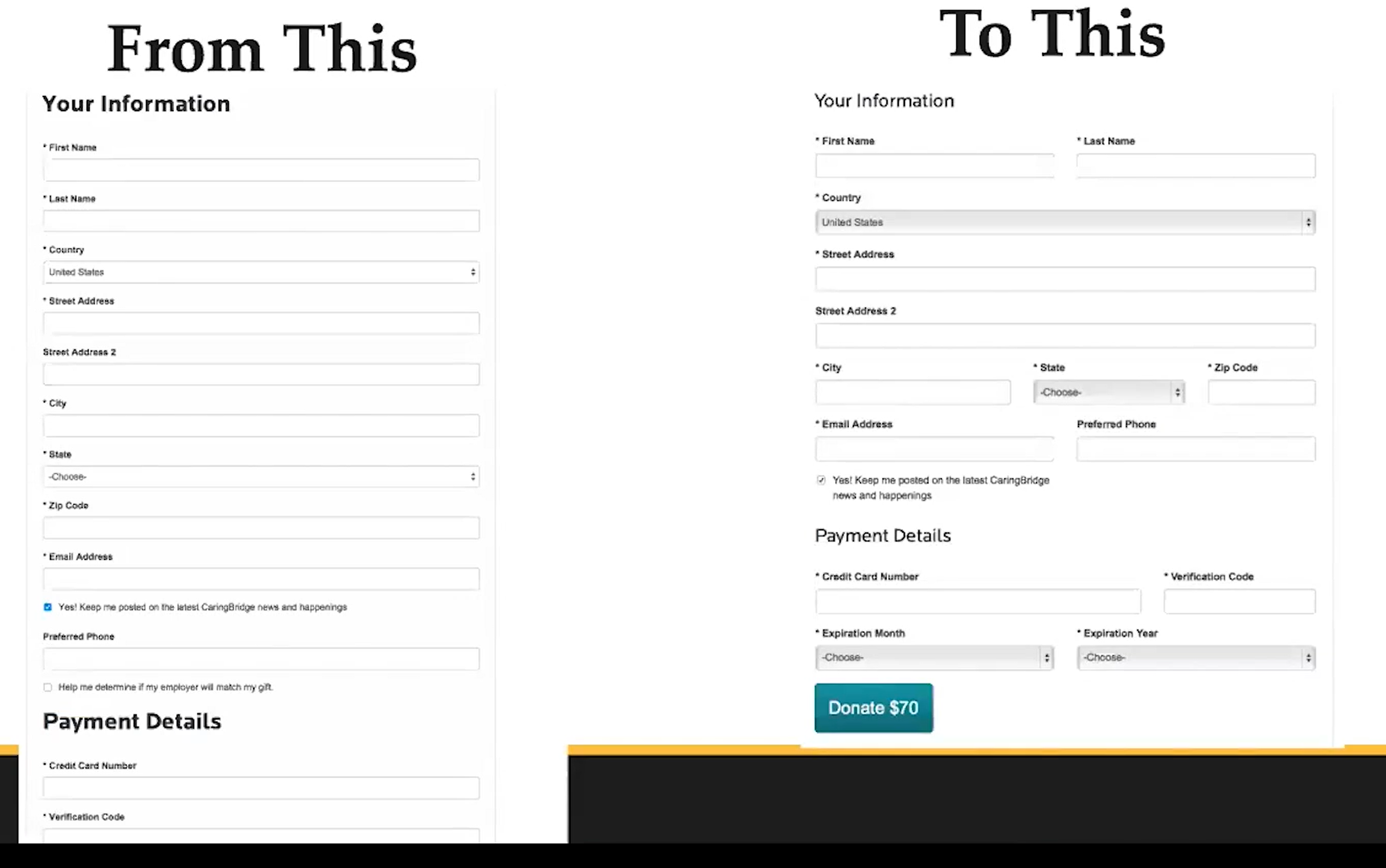
Although these two forms ask for the same exact information, one minimizes the perceived amount of information given. As a result, the shorter form led to a 39% increase in donations.
No Supporting Messaging
One final way that donation pages fail donors is lack of support messaging to build trust.
Adding something like a Charity Navigator or Guidestar seal near the button at the bottom of your form will help increase donations. You should also use the area underneath the button to validate the security of the information and where the gift is going.
Download & Learn More
NextAfter has a donation page optimization template available on their website. You can also learn more from them through their online courses!
The Experts
Each episode of Give LIVE is designed to bring insight and expertise to the subject. This month we’re bringing 3 experts on this topic:
Nathan Hill

Nathan is Marketing Manager at NextAfter. Nathan’s experience with fundraising and nonprofit marketing are at the center of this conversation.
Karmen Kendrick

Karmen runs The Support Concierge, a web development and marketing agency focused on bringing eCommerce success to small businesses.
Michelle Frechette

Michelle Frechette is the Head of Customer Success at GiveWP, is co-founder of UnderrepresentedInTech.com, Podcast Barista at WPCoffeeTalk, and board member at Big Orange Heart.
Register Now for Our Next Give LIVE Event
In May we’re going to focus on mental wellbeing, both as a company and through our next swag fundraiser. Register now to join us for our next Give LIVE event on May 19th at 9AM PT: “Mental Health and Remote Work: Give LIVE with Big Orange Heart.”
About the Author
Michelle Frechette
Once called “The busiest woman in WordPress” by Matt Mullenweg at WCUS 2022, Michelle Frechette is the Executive Director of PostStatus.com and the Program Director for WP Includes (wpincludes.me). In addition to her work at Post Status, Michelle is the Podcast Barista at WPCoffeeTalk, cofounder of Underrepresented in Tech, creator of WPSpeakers, creator of WPCareerPages, co-founder of SponsorMeWP.com, co-founder of SpeedNetworkOnline.com, author, and a frequent organizer and speaker at WordPress events. You can learn more about Michelle at meetmichelle.online.