
How to Build a Donation Landing Page with Beaver Builder
First impressions are important. Building a powerful donation landing page helps your donors understand your mission quickly and better ensure your campaign success. Here’s how to do that. A well-crafted landing page has proven to be an excellent tool for quickly conveying a message and can significantly increase your conversion rate resulting in more people…
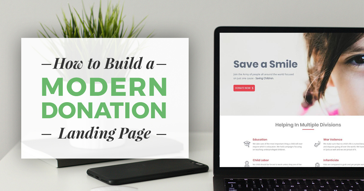
First impressions are important. Building a powerful donation landing page helps your donors understand your mission quickly and better ensure your campaign success. Here’s how to do that.
A well-crafted landing page has proven to be an excellent tool for quickly conveying a message and can significantly increase your conversion rate resulting in more people supporting your cause. Landing pages often target a specific audience and are helpful for creating more successful marketing campaigns. However, many times landing pages are perceived to be beyond the means of a nonprofit due to the assumption that they can be expensive to design and build.
Is this really the case? Not at all.
Why Create a Donation Landing Page?
Landing pages provide a succinct, central location for a call to action. If you have a campaign going on that you want to drive traffic to, a donation landing page is a must. The perfect use-case for something like that is #GivingTuesday which is coming up soon. Create your #GivingTuesday landing page, and drive all your social traffic to that one page. That should result in a more powerful call to action and more donation conversions.
The Tools you Need to Build your Donation Landing Page
With the introduction of tools like Beaver Builder, PowerPack Beaver add-ons, and the Give donation plugin it’s possible to quickly build a fully functioning nonprofit campaign landing page without touching a single line of code.

In this post, we’ll go over a step-by-step tutorial on how you can create a fully functional landing page for a nonprofit campaign without spending a dime.
For this project, we will be using the previously mentioned plugins which all are available at wordpress.org for free to download and install. Make sure you have downloaded and installed them before going any further.
Now that we are all set up, let’s see how we can design a landing page that converts and can help your cause in accepting more donations online.
How to Create a Donation Landing Page
While you may have a specific design you want to achieve, we will still go step-by-step and with a specific example. Many of the following steps you can tweak on your own to create something more specific to suit your needs. Ready? Let’s begin.
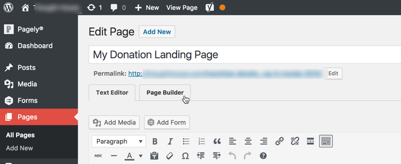
First, we will create a new page in WordPress for our campaign. Add a new page by going to WP Admin > Pages > Add new. Provide a proper page name and click on launch “Page Builder” tab to enter the builder.
The builder includes a visual representation of your future landing page, which should be currently blank, and a right sidebar element containing all the modules for you to build out your page. Let’s start building.
Step 1: The Hero Section
The “hero” section is arguably the most important part of the page as this is the first section that the visitor sees when they visit the landing page.
The key to a good hero section in simplicity and preciseness. This is the objective we will go for in our hero section as well.
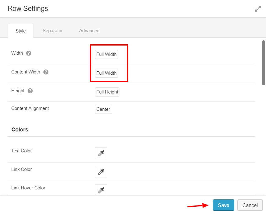
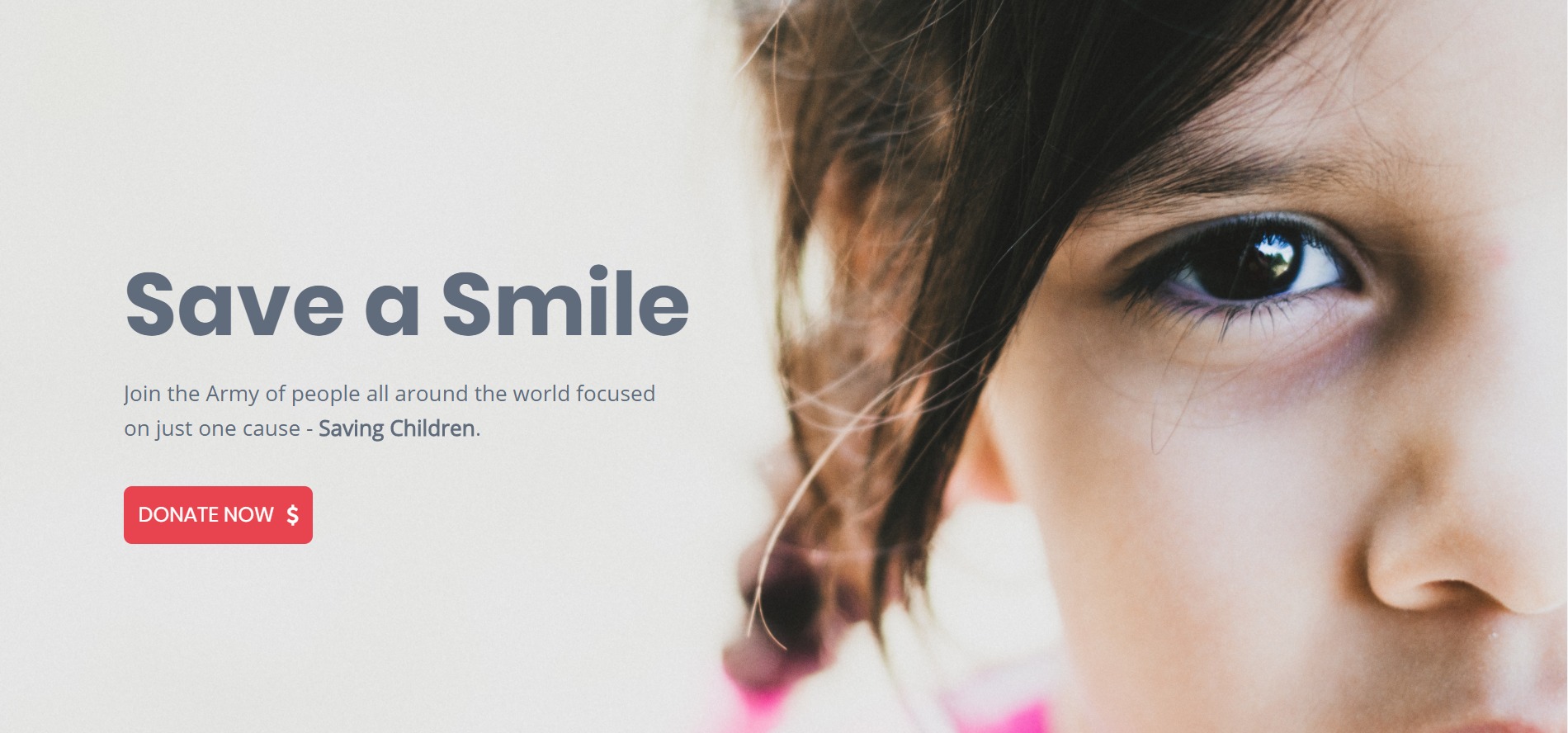
Step 1.1: Add a row to the page by dragging and dropping it on the page. Next, open the row settings and add an image to the row background. Also, set the width of the row and content to full width.
Note: For the image you should choose one with the emphasis on the right side. As you’ll see in the next step we’ll make the main hero text appear on the left. This is a common layout for landing pages that is familiar to many users.
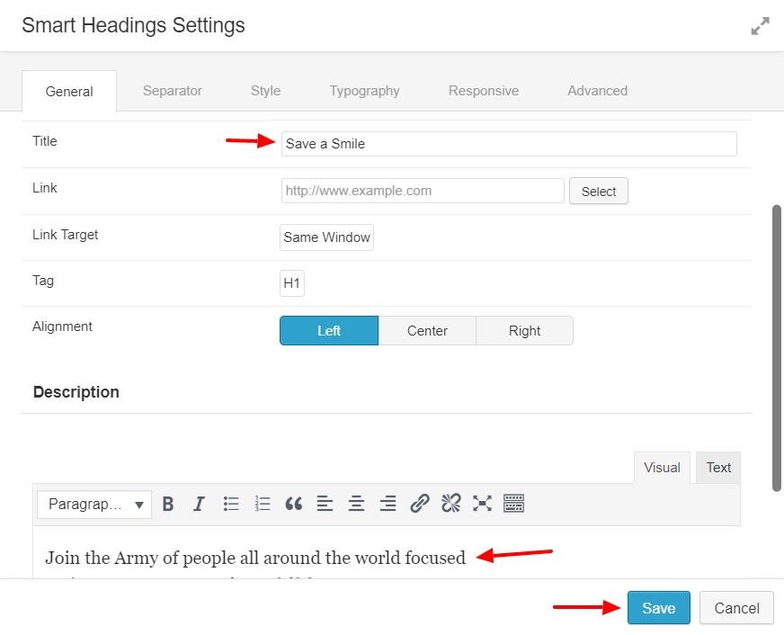
Step 1.2: Next we’ll add some text by going to the PowerPack Modules and drag and drop a Smart Heading module onto the row. Then, make the following changes to the module:
- Add main heading text that’s quick and impactful
- Add a description text that explains your mission, quickly
- Alignment – for this example we will position it left
- Customize the text color and typography to suit your needs
Step 1.3: Now we need a donation button under the heading to ensure visitors can quickly donate. Add a Donation Form from the Give modules, select your donation form from the list and change the display style to “Button Only”.

Note: If you cannot find a form, chances are you have not created a donation form yet. Create a form first, and then you will be able to select the form from the list.
When you are done, your hero section should look something look like this:
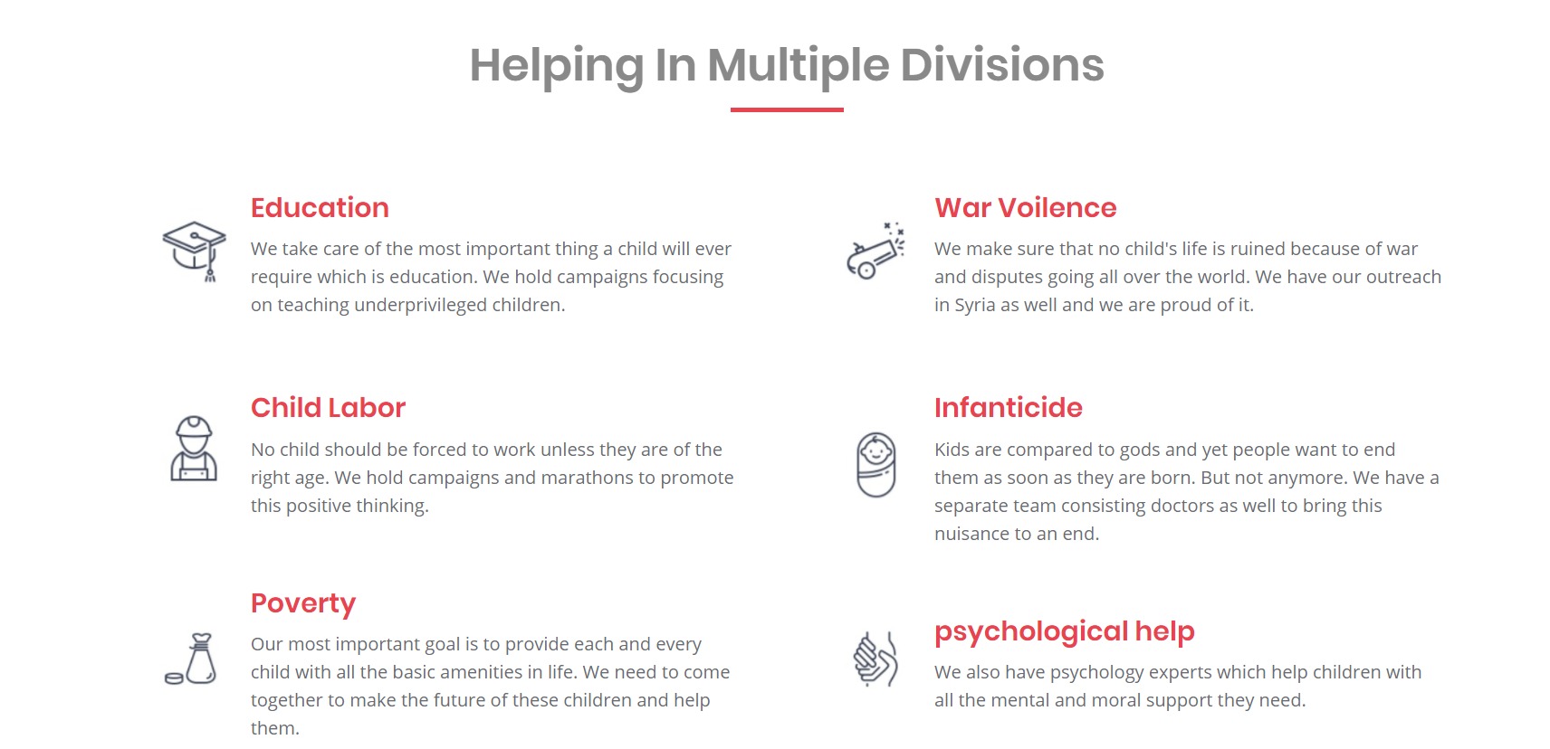
Step 2: Adding the Informational Section
After you give a quick pitch in the main hero section let’s go into a bit more detail of what exactly we’re doing for our cause. We’ll do this with another heading followed by a two row section.
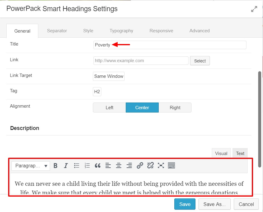
Step 2.1: Add a another empty row like we did above and then a Smart Heading to the top of the row. Add the text in the module and a separator as well:
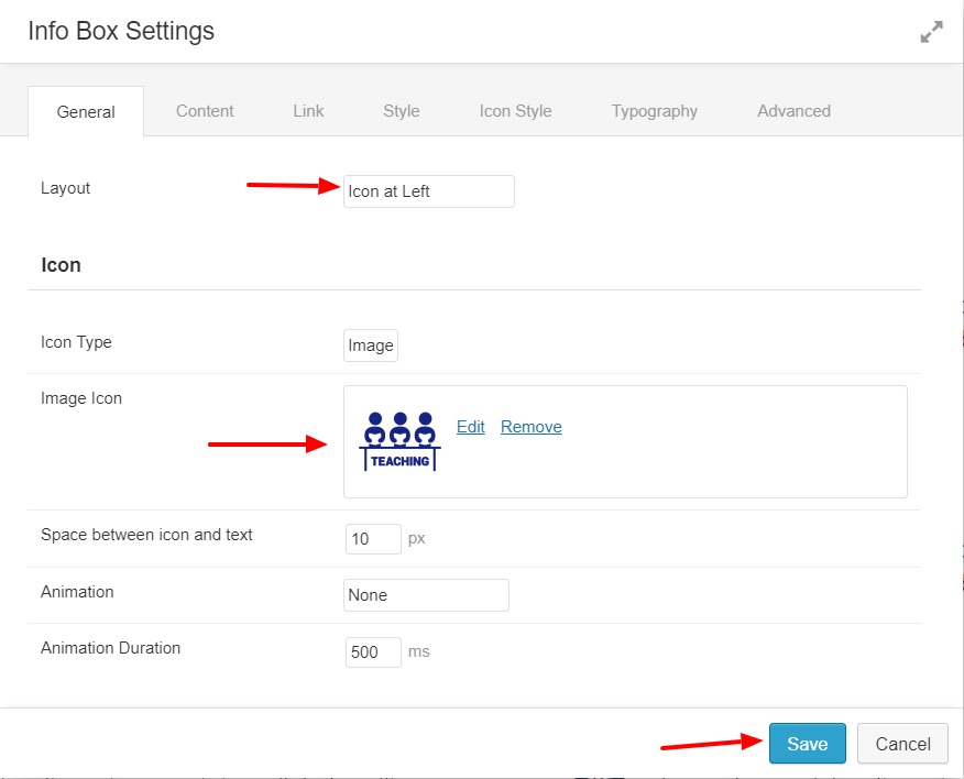
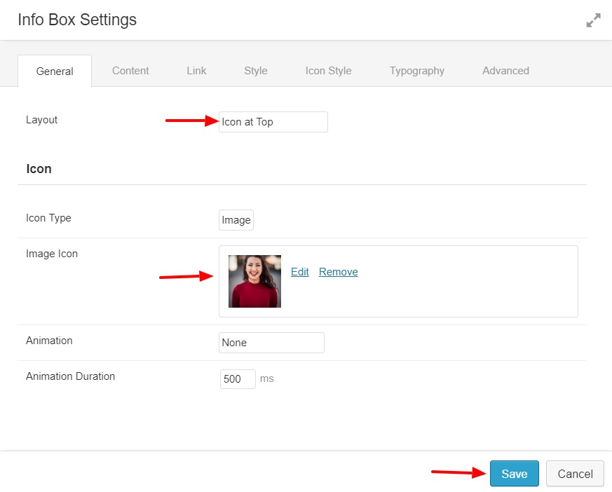
Step 2.2: Add a new 2 column row layout under the one we added above. Now, go to the PowerPack module and add the Infobox module to one of the columns. Add a relevant Icon to the box. We also made the following changes to the page as well:
- Customized the typography and font color.
- The icon layout is left
- Added a impactful title & description
- Added hover effects to the text and background – these details really can make your page shine
Click save on the module and you should now have a single section. Now let’s make some more.
Step 2.3: Click on the copy icon on the top right corner of the infobox we just created and make multiple copies of the box and arrange them accordingly. Now, you just need to change the Title, Description, and Icon and the rest of the settings will remain the same.
This is what your Row should look like once you are done:
Step 3: Adding the About Us Section
The “About Us” section has two primary elements: a Photo and Text Editor. We’ll begin this section like we did above by adding a two row section.
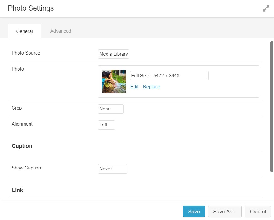
Step 3.1: Add a another two column row layout. Add a Photo module on the left column and adjust the margins to 0 so that the image fully 100% of the row’s width and height.
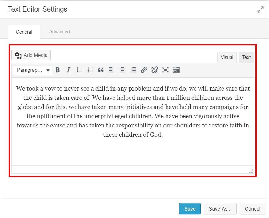
Step 3.2: Add a Text module on the right side of the page and add the respective information there. Adjust the typography so that it fits 100% width and height within the row on the page.
Step 3.3: Now we add some Button elements. We will use the Dual Button module within PowerPack. Add the module under the Text Editor and change the properties of the button:
- Button text and link – if you want to go to a page to read more and a single donation form that’s what we’re doing here.
- Round corners – For style
- Color – Text, Background
- Borders
- Hover Effects
- Alignment
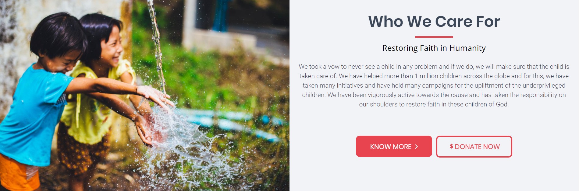
Once you have done all the changes, the page should look something like this:
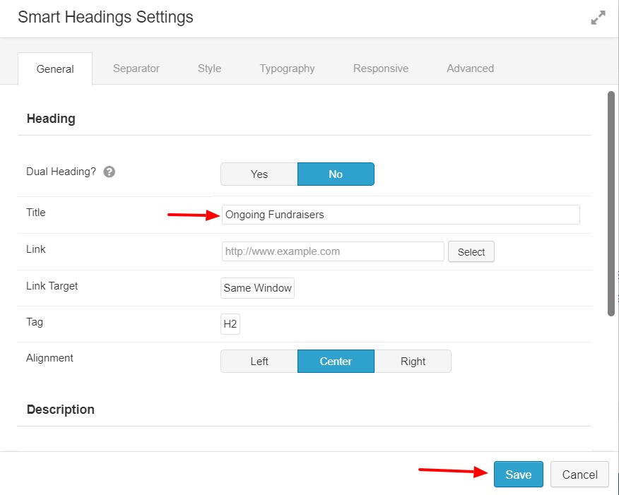
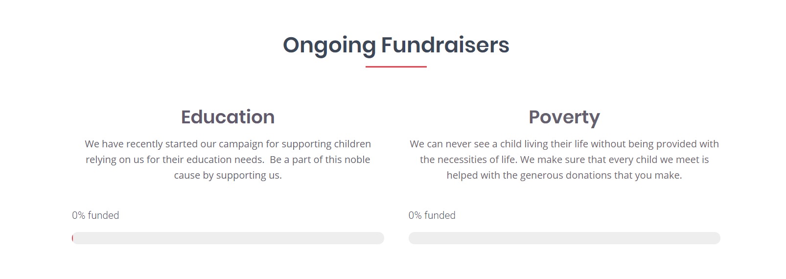
Step 4: Adding the Ongoing Fundraisers Section
The “Ongoing Fundraisers” section has two primary elements: a Photo and Text Editor. We’ll begin this section like we did above by adding a two row section.
Step 4.1: Add a Smart heading module similar to the previous one we added. Just follow the same steps and change the text.
Step 4.2: Now, add another 2 column layout under the Smart Heading and add a smart heading module in each of the columns. Next change the title to the fundraiser campaign name and the description with the details of the information about the campaign. Do this for both of the Smart Headings.
Step 4.3: Go to the Give modules and add a Donation Form Goal under each of the Smart Headings. Select the Form and click save. You should see the donation form appearing on the page:
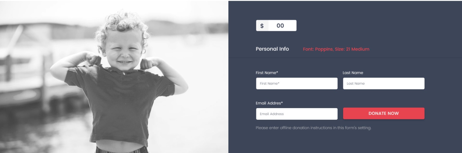
Step 5: The Donation Form Section
Here we will finally provide the visitor with the full donation form.
Step 5.1: Create the same layout for this section like we did for the About Us Row. But, instead of the text editor we will add a Donation Form.

Step 5.2: To add the donation form, click on Give modules and then drag and drop the Donation Form from the list. Select the Donation Form from the list and click on the save button.
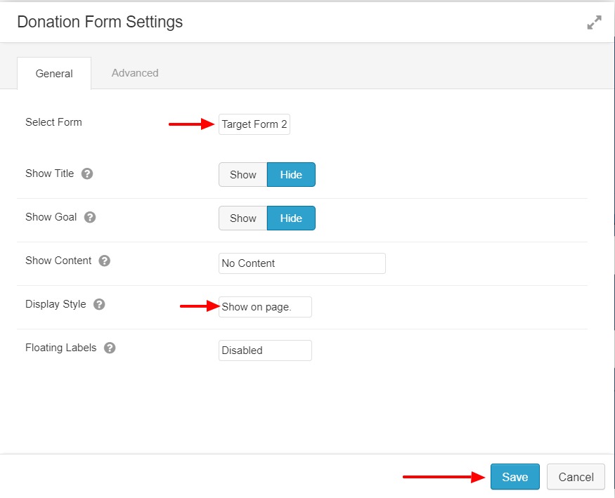
Step 5.3: Adjust the margins and padding of the modules as well as content so that they look perfectly aligned.
This is what the row would look like once it is done:
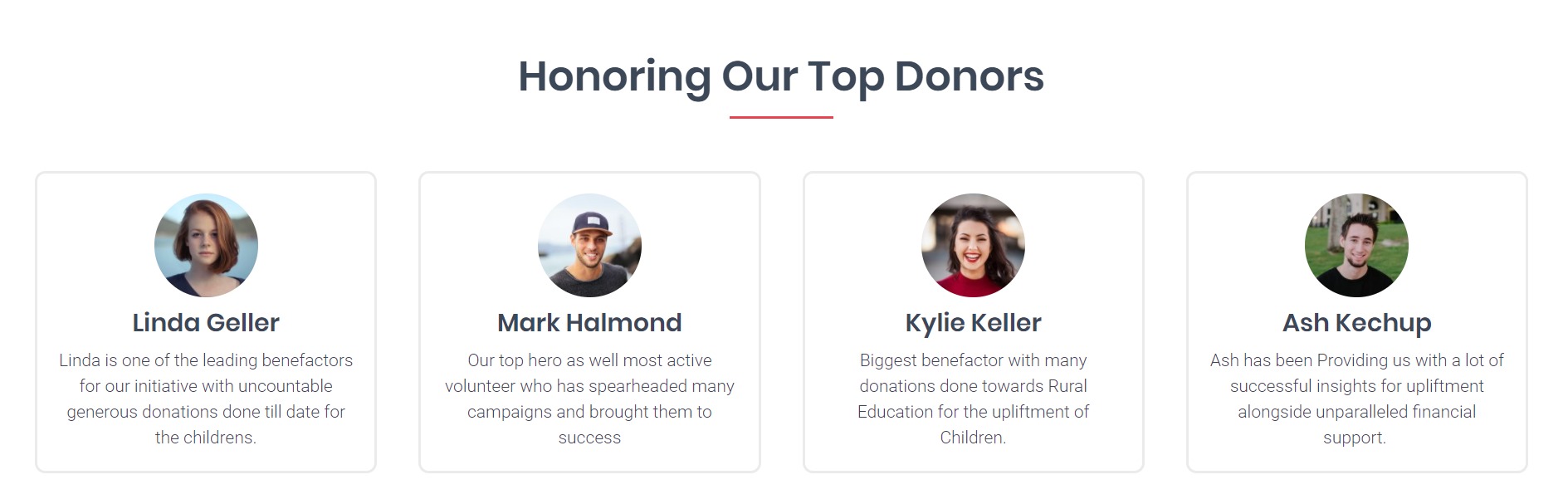
Step 6: Top Donors
Recognizing the top donors always increases the conversions as it provides social proof to the viewers. Follow the steps to make a social proof row which features top donors.
Step 6.1: Add a smart heading module and alter the text, separator, color, and Font Face.
Step 6.2: Add 4 column row layout and add infobox module to each of them.
Step 6.3: Select the photo of the donor and crop it to circle.
Step 6.4: Add the name of the donor and little description about them as well. Give it a nice border and background as well as hover effects to the Infoboxes and when you are done; the row would look like this:
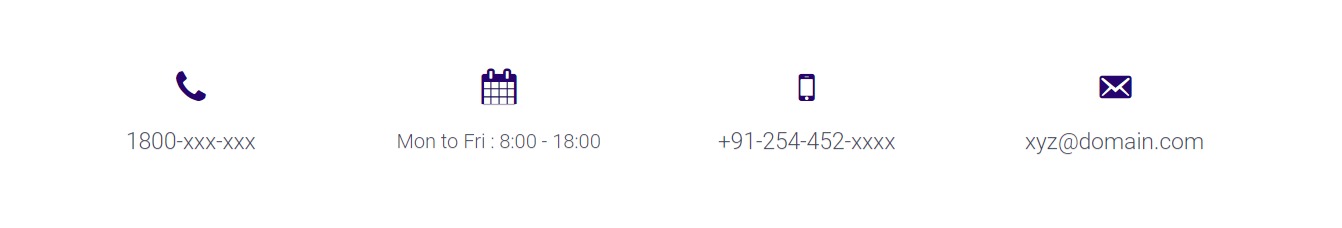
Step 7: Contact Details
Step 7.1: Add a 4 column row layout and add infoboxes to all of them.
Step 7.2: Select the icon for the box, and add the contact detail in place of the title. Do this for all the boxes.
Once you are done with everything, check again if you want to make any changes on the page. If you are satisfied, click on the Done button at the top right corner of the page and then click on Publish Changes Button to make the page live.
This is what your final page would look like:

Congratulations, your page is now online!
There are many changes that you can make on the landing page, and you can increase the tools and capabilities to change the page as well with addionional add-ons:
- Beaver Builder Pro – well worth it. Great support and 500,000+ active installs can’t be wrong.
- PowerPack Pro Version – lots of powerful new modules for a great price with a great team behind it.
- Give add-on bundles – recurring donations is a must have.
If you liked the post and found it useful, pass it along as well so they too can help in making the world a better place. :)
About the Author
Puneet Sahalot
Founder of PowerPack Beaver Addons and CEO of IdeaBox Creations. WordPress enthusiast. WordCamp speaker & organizer. Travel & adventure lover.


