Don’t Let Your Sidebar Become a Sideshow Distraction
Why do you go to the circus? Is it for the games and prizes? The cotton candy? The high-wire act or the acrobatics? Most likely you don’t go for “Lobster Boy,” or “Four-Legged Lady Corbin” or “Wang the Human Unicorn.” Your donation page should follow suit. Make it about donations, not the sidebar distraction. If…
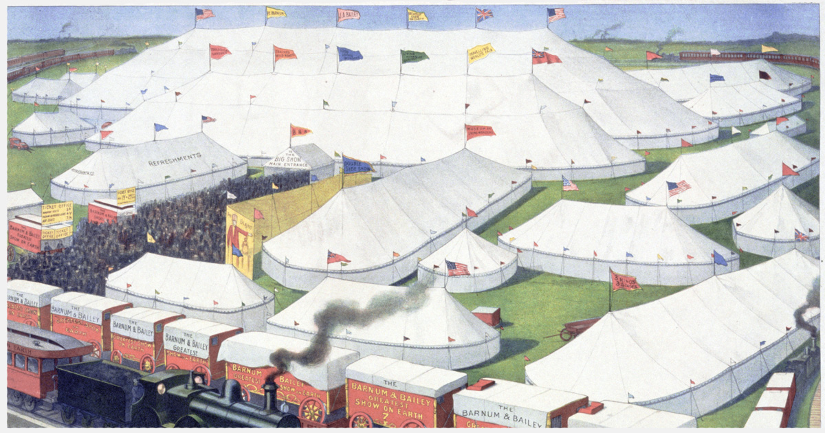
Why do you go to the circus? Is it for the games and prizes? The cotton candy? The high-wire act or the acrobatics? Most likely you don’t go for “Lobster Boy,” or “Four-Legged Lady Corbin” or “Wang the Human Unicorn.” Your donation page should follow suit. Make it about donations, not the sidebar distraction.
If you’ve spent any amount of time in WordPress you’ve been introduced to the idea of sidebars in general. For the uninitiated, the sidebar is typically a vertical column — often with a smaller width — to the right or left of your main content area. In WordPress, sidebars can really be any block of content as your theme dictates, but the vertical column is the standard.
Often this is used to display related content. For example, blog articles very often will show you related articles in a sidebar, or social media icons, or occasionally sidebars are chock-full of advertising (*shudder*).
Sidebars are very effective at adding additional and related information to the main content. They’re good things. But just like anything in web design, abuses abound.
The Give Sidebar
Give has it’s own sidebar as well. This means you could technically have two sidebars on your donation pages. As they say: “With great sidebar options comes great responsibility.”
We built Give to have it’s own unique sidebar for a couple reasons:
- To give theme authors more flexibility with the page layout of the single Give form template.
- To allow users to add helpful information as an “aside” to their main campaign content.
So understanding exactly how sidebars can be used — and abused — is important to having an effective donation page.
Understanding Semantic Markup
To best understand sidebars, we can look to the folks that created the specs for proper HTML markup. No seriously. There is HTML code dedicated just to sidebars. It’s called “aside.” Here’s the description from the World Wide Web Consortium (the people that decide how all web pages should be rendered in browsers):
“The aside element represents a section of a page that consists of content that is tangentially related to the content around the aside element, and which could be considered separate from that content. Such sections are often represented as sidebars in printed typography. The element can be used for typographical effects like pull quotes or sidebars, for advertising, for groups of nav elements, and for other content that is considered separate from the main content of the page.” W3.org
Now, it is not required to use the aside element for sidebars, but that is its intended purpose. Your theme may use a div or a section with each widget being wrapped with an aside. But according to the HTML specs, aside is the appropriate markup for a sidebar.
Let’s take a closer look at the spec above. There’s a couple things that stand out there to keep in mind.
First, they say the aside is for content that is “tangentially related” to the main content. That means first that it is actually related and second that it’s less important.
Secondly, they say specifically that it could be “considered separate” from the main content. That’s a really important point. That means it almost could stand on it’s own, but because of the first point its meaning and significance is enhanced when it is placed in relation to the main content.
Understanding Donation Conversion
Besides all the geek-ery of HTML markup, we also have to consider actual human behavior when it comes to the use of sidebars. This is where our circus analogy comes in strong. If you want people to enjoy the high-wire act, don’t add a big image of the “Lion-Faced Man” next to your tightrope walker on your billboards. Feature the tightrope walker with a full-bleed image and just add “tangentially related” text about the sideshow in a corner.
We humans are easily distracted — especially when you give us shiny buttons or images to click on. For example, the Facebook News Feed has evolved a lot over the years. They are working harder and harder to encourage you to click stuff. What’s their latest technique? Make the stuff in your feed move automatically! You’re casually scrolling through cat pics when suddenly you see Wonder Woman beating up bad guys. Of course you’re going to pause and check that out. It’s human nature.
This happens far too often with sidebars as well. You’ve taken the effort to write an amazing article, but you’re visitor bounce rate is sky-high because you added a scrolling Twitter feed to your sidebar. I wonder why!? Maybe because something is moving in the sidebar and pulling your visitors eyes away from the important stuff over to the “tangentially related” stuff.
Now imagine filling your donation page with “tangentially related” moving things. We’re all smart here, you know exactly where this is going. Donation conversion rates plummet when you put competing clickable things next to your main attraction: the Donate button.
Effective Use of the Give Sidebar
Okay, now that I’ve got you sufficiently frightened of using the sidebar at all, here’s good ways to use it with Give. It all depends on the purpose of donating. Let’s use an example of an Animal Rescue Shelter.
An Animal Rescue Shelter
Let’s say you’re doing a campaign to raise funds for new kennels for your animal shelter. The point is to show that your organization needs these new kennels. Of course, you’ll write great content to display with your Give form, but what could you put in the sidebar that is tangentially related and won’t distract from the purpose?
- Statistics: Show your donors you’ve done your homework. Have a quick list of statistics on how larger, more secure kennels greatly improve the health and happiness of animals in shelters. The great thing about a list of Stats is that it’s totally static, but adds great detail to your campaign.
- Testimonials: A great way to encourage donating is to show potential donors what other donors already say and believe about your organization. The sidebar is a great place for content like this. It enhances your main campaign information.
- Photo Gallery: I hesitate to recommend this, because it could go wrong, but a photo gallery can help give your donors a visual idea of why your campaign is so important. You could show the current sad state of your kennels in a gallery, just don’t do a carousel or have any kind of navigation. You *could* have them clickable to see them larger in a lightbox so they can see them up close and personal, but think carefully about whether that really enhances the urge to donate or distracts attention away from the Donate button.
What NOT to Add
To help illustrate the potential trouble sidebars can cause, here’s some things that you might be tempted to add to your sidebars that you should rather avoid:
- Contact Information or Social Media Icons: It seems totally reasonable that you should inform your donors how they can get in contact with you. But actually, when they are on the donate page, all you want them to do is donate. Putting contact information or social media icons suggests an alternative action other than hitting donate. It suggests calling or emailing to ask questions, or cruising your Facebook or Twitter feed instead. Don’t allow your sidebar to suggest any action other than donating.
- A Map: Similar to contact information, you might be tempted to give them directions to come see the sad state of your kennels in person. Nope. Don’t suggest they drive or explore Google Street View instead of donating.
- Links to the Kennels you want to buy: This feels like wisdom, but it’s not. You want to show them exactly what their donations would be helping make happen. So you add links to the kennels you’ll purchase. But what will happen is they’ll go to that link, then see a random ad in that sites sidebar and end up following a rabbit hole of links until they’re watching cat videos on Facebook instead of donating. Instead of links, put images of the new kennels either in your sidebar or in your main content. Just no linking.
Tools for Managing Sidebars
So now that we know what we do and don’t want to do with our sidebars, how to we manage them in WordPress and Give?
First off, you don’t need to put anything in your Give sidebar at all if you don’t want to. Typically, if you don’t put any widgets in the Give sidebar nothing will show there at all. Occasionally though, the theme doesn’t handle that well. So you might need to disable your Give sidebar completely. Do that by going to “Donations > Settings” and the Display Options tab. There you’ll see a setting to disable your Give sidebars completely.
Your WordPress sidebars, on the other hand, derive completely from your theme. Some themes might not even support sidebars at all. Most do, and some support dozens of sidebars for all kinds of crazy reasons. Your Give pages should inherit the main sidebar that is applied to any of your pages.
But what if you want to show certain widgets on certain Give forms? WordPress doesn’t have a way to control that by default, but whether you are using the Give Sidebar or a sidebar from your theme, here’s a couple plugins that can help you manage your widgets with far more control:
- Display Widgets — allows you to choose — per widget — where on your site you want to display that particular widget. You can choose by page or post, or even by whole category.
- Widget Options — this is a newer plugin that is the same idea as Display Widget but with a few more options, like disabling the widget on mobile devices.
- Jetpack Widget Visibility — if you are already using Jetpack on your site, it has a “module” called Widget Visibility which is the same idea as the two plugins above. It works well and you might as well use it instead of the previous if you already have Jetpack on your site.
- Content Aware Sidebars — this is a really great plugin that lets you choose which sidebar to display next to your content based on the content itself.
Are Your Sidebars a Distraction?
In light of all this, take a look at your donation page, and evaluate your sidebars. Are they like the Lion-Faced Man, or are they enhancing your awesome campaign content? I challenge you to review them and ask whether you just want to ditch them all together, or swap out the content for something much more useful.
About the Author
Matt Cromwell
Matt is co-Founder of GiveWP and now Senior Director of Customer Experience at StellarWP. He’s passionate about helping WordPress product owners level up their marketing and monetization strategies. He’s the founder and a co-host of WP Product Talk and Glam that Plugin. Matt was born and raised in California, but lives now with his wife and four children in Germany.