The Guide to Web Accessibility for Nonprofits
Is your nonprofit website accessible to everyone? Website accessibility for nonprofits is critical for your fundraising and mission success.
Web accessibility can make or break your nonprofit website.
It’s surprising how many accessibility errors pop up on a number of websites, impacting usability and donations. A potential donor won’t make a contribution if they can’t use your website with ease.
But what does website accessibility really mean? How can you ensure that your design is compliant with current standards?
In this guide, we’ll walk through all the basics of web accessibility so you have a foundation for success. The good news is that many of the things that make a website accessible are also rooted in design best practices.
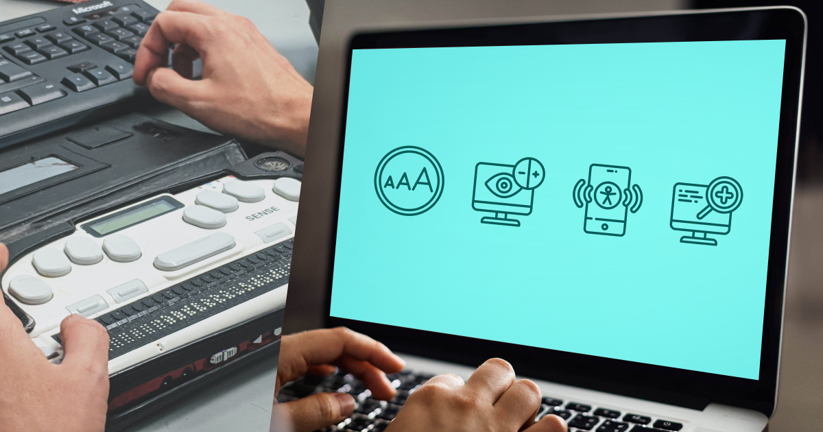
What is Web Accessibility?
An accessible website is one that is equally usable for all website visitors, including those with physical disabilities or limitations. Accessibility standards ensure that individuals with vision, hearing, speech, cognitive, or other impairments can interact with content with the same user experience as those who do not.
You don’t want someone to visit your website and not be able to function it.
“Accessibility overlaps with other best practices such as mobile web design, device independence, multi-modal interaction, usability, design for older users, and search engine optimization. Case studies show that accessible websites have better search results, reduced maintenance costs, and increased audience reach, among other benefits.”
– Web Accessibility Initiative (W3C)
There are several key organizations that have created guidelines, standards, and checklists for website accessibility. Web Content Accessibility Guidelines (WCAG) were initially developed in 2008 and remain the gold standard in terms of accessibility today.
Four Principles of Web Accessibility
WCAG outlines four principles of website accessibility that break this concept down into understandable – and actionable – elements.
- Perceivable: Information and user interface elements must be presented to users in an understandable way. Considerations include text size, alternatives for live elements (such as recordings), adaptable or simplified layouts, color and contrast for visual elements.
- Operable: Users must be able to interact with the interface. Considerations include keyboard functionality, timing of elements, limiting flashes in animation, easy of navigation, and use of alternative input operations.
- Understandable: Information and how the website works should be intuitive. Considerations include readable and understandable language, predictable patterns, as well as help and error notifications.
- Robust: Content needs to be interpreted by a variety of user agents and assistive technologies. Considerations include parsing, content values, and status messages.
Web accessibility can be graded using a scale:
- A: Meets minimum accessibility requirements
- AA: Medium level of accessibility reached
- AAA: Gold standard of web accessibility
Why Web Accessibility Matters for Nonprofits
Web accessibility is a big deal because not only do you need donors to be able to use your website, but also those who need your services.
An accessible website is an inclusive website. Inclusivity is paramount for nonprofits.
Whether accessibility is required is still a little ambiguous. Courts are still divided over whether the American Disabilities Act applies to online locations. However, that hasn’t stopped it from hitting the courts.
But why leave it to the courts? An unclear law can leave your organization open to litigation, which can be time-consuming and costly. So it’s best to keep your website as accessible as possible.
Here’s the bottom line for nonprofits: To maximize impact, the greatest number of people should be able to reasonably and easily interact with your website. This includes everything from reading content or sharing information to making a donation.
If the design is not accessible, you can lose potential leads and even ostracize the very people your organization may be trying to help.
Web Accessibility Best Practices
It can be a little overwhelming to start digging into all of the website accessibility documentation out there.
Here, we’ll outline some best practices and in the next section are some tools you can use to look up specific guidelines and run checks on your website to ensure that it is usable for all.

Like What You’re Reading? Subscribe Here!
Newsletter Opt-in
Color Contrast
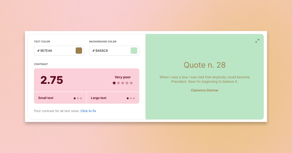
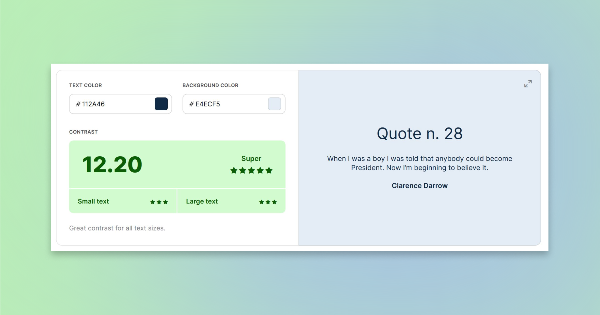
Ensure contrast between colors and elements: Color contrast is vital for those with vision impairments so that differences in color are easy to see. WCAG uses a color contrast ratio to make understanding this concept easier.
The scale is from 1:1 (unreadable) to 21:1 (ideal readability). A 1:1 ratio would result from using the same color for text and the background. A 21:1 ratio provides the highest level of contrast, such as black text on a light background. WCAG requires a contrast ratio of at least 4.5:1, although this minimum threshold will generate an AA rating, it is considered difficult to read by many people. A better option is to aim for a ratio of 7:1, which generates a AAA rating.
The other consideration with color contrast is to also use a secondary element – such as a text instruction — to convey information. In practice this means don’t just use a green check and red x, to accept or cancel. Also use the words to best convey the information.
Alt Text
Images should include alt text in the markup – there’s a place for alt text with every media item in WordPress – that tells users what is in the image. A photo of a dog, for example, may have alt text that says “dog in a park.”
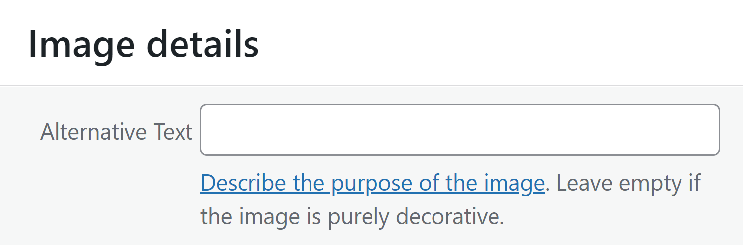
Images that are more complex should also include full captions for helping users better understand content.
Audio, Video, and Recordings
Audio, video, and live online broadcasts should include the ability for later playback and transcripts. Provide visual access through in-sync captioning when possible.
Code
Your website needs to be technically sound to be fully accessible. Screen readers and some other assistive technologies can struggle with poorly coded websites.
Functionality
Website functionality should work using a keyboard for all elements as well as work with voice integration systems.
Labels and Inputs
Form fields and user interface elements should have text labels that make interaction and context clear.
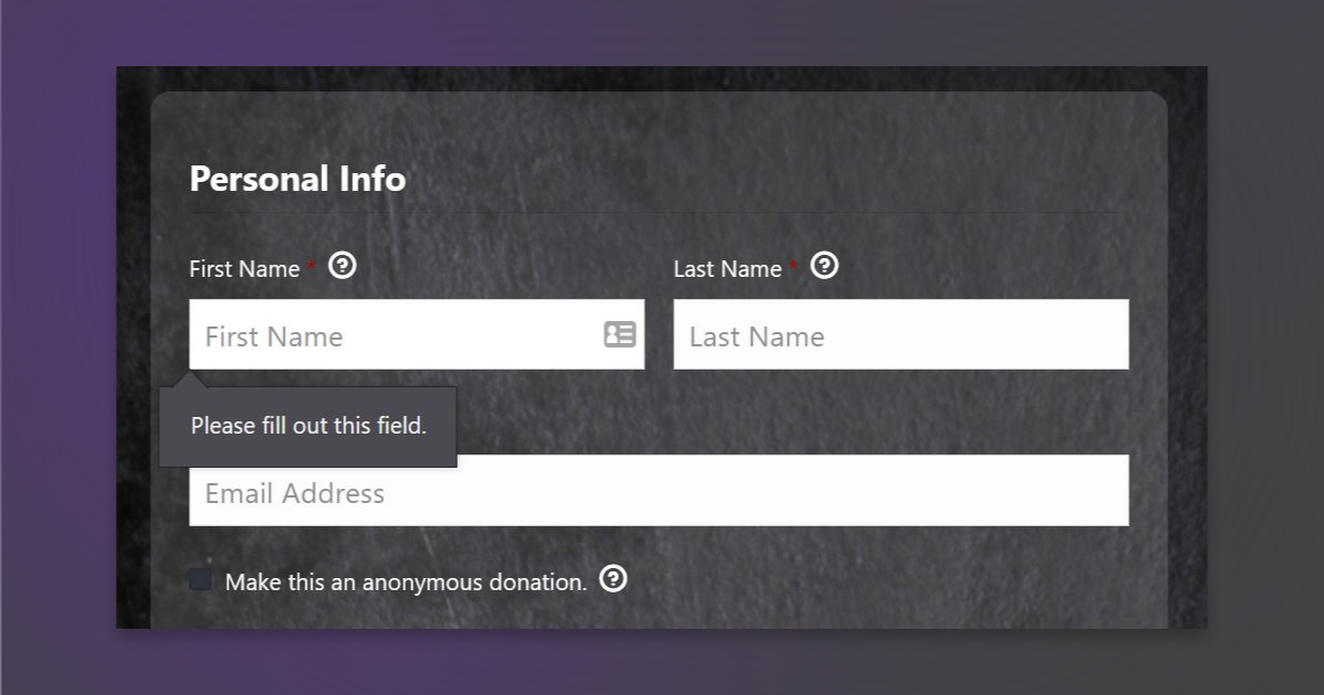
Alerts, notifications, and error messages should help explain functionality to users when something is not right. These messages can tell users when they enter something wrong, such as an improper format for an email address, to help ensure success in form fields.
At the same time, confirmation messages ensure that users know when an action is successful. That’s where your donation confirmation note comes into play.
Amplify your fundraising with a GiveWP Plan
Navigation
Websites should have a skip navigation feature. Further, all navigation elements should be fully supported by keyboard use with a logical tab order. Generally this is from left to right or top to bottom.
Readability
One of the best things you can do with your nonprofit website is provide clear, understandable information in a way that’s easy to read. All content should be easy to hear or see and work equally well on various platforms, including desktop and mobile.
Plain language, proper grammar, and context all contribute to overall website readability, understanding, and accessibility.
Space and Headings
Appropriate use of white space, positioning, and headings in website content is more than a design element, it’s also an accessibility best practice. Using headings – H1 through H6 – with appropriate CSS can actually reduce cognitive load and make the website easier to scan.
Proper H1 organization creates a logical flow for content that helps users process information.
Additionally, grouping related elements and leaving space between unrelated items can further reduce cognitive load.
Tools and Resources for Your Nonprofit Website
How many of these things are you already doing on your nonprofit website?
There are plenty of online tools, checkers, and resources to help you grade where you are and provide recommendations on what more you can do.
- A11Y WCAG Compliance Checklist
- How to Meet WCAG (Quick Reference)
- Hemingway App Readability Checker
- Hubspot Website Accessibility Checklist
- Colorshark Color Contrast Checker
- Google Accessibility Tools
- Akbar (simulates various types of user experiences so you can see what users see on your website)
- Accessify (accessibility performance test)
- The A11Y Project resource list (books, courses, organizations, and more)
WordPress Plugins
The latest versions of the default WordPress theme, anything later than Twenty Seventeen, have a lot of accessibility controls included. In addition, there are some reputable WordPress plugins that you can install to help with accessibility implementation.
- WP Accessibility: Helps solve common accessibility issues without a lot of setup.
- WP Accessibility Helper: Helps you work through elements like font size, contrast, titles, alt and more.
- WA11Y – The Web Accessibility Toolbox: Package of tools to test your website and adjust settings to improve accessibility.
- Accessibility by UserWay: Helps you strengthen accessibilities weaknesses in your website.
An Accessible Website is Better for Everyone
Accessibility can seem overwhelming and complicated, but it doesn’t have to be. Chances are that a lot of the things you might just see as good design, contribute to overall web accessibility.
And then there’s this reality: If your website isn’t accessible to all you could be missing out on key fundraising opportunities or donations.
About the Author
Carrie Cousins
Carrie Cousins has more than 15 years of experience in media, design, and content marketing. She’s a writer and designer, has an MBA from Virginia Tech, and is passionate about creating amazing experiences for businesses online. Her work has been featured in publications such as Design Shack, Webdesigner Depot, The Next Web, and Fast Company. She’s an avid runner, which comes in handy with a trio of Australian shepherds at home.