Using the Give API to Create Charts with ChartJS
What if I told you that the Give API + JavaScript = Awesome Reporting Tools? Mind-blown, right? We already know how awesome Give is, but what if you need more power or visual aid from the data? Charts are an easy way to evaluate how a form is performing, how much donors are donating, or…
What if I told you that the Give API + JavaScript = Awesome Reporting Tools? Mind-blown, right?
We already know how awesome Give is, but what if you need more power or visual aid from the data? Charts are an easy way to evaluate how a form is performing, how much donors are donating, or even which gateway people use the most.
For the purpose of this article, I am going to work on an example pie chart that will compare all my forms and, more importantly, demonstrate which one performs best.
Chart.js
D3 and highcharts are powerful tools for JS data, but for the sake of simplicity, we are going to use Chart.js. It’s powerful without being overly complex.
Chart.js has a few awesome charts built into its library with a large contributor community of people who extend and add features. Out of the box you get line charts, bar graphs, radar charts, polar area charts, and pie / doughnut charts. As it is, it’s powerful. A closer look tells us it really just uses the HTML5 canvas element to draw so it is easy to tap into and extend if you want further control.
Give API
Give comes with an amazing developer’s dream feature: an API. While the WordPress REST API is coming into core, it isn’t there yet. As of now the Give API gives you the same power, but built into a production-ready API. There is some great documentation about the API, and the available endpoints which include:
- /donations
- /stats
- /forms
- /donors
If you are not yet familiar with the Give API, I suggest you read that documentation first since I’ll reference it often throughout this article.
For this project, we are going to focus on the /donations endpoint, which gets the latest donations made across all the forms on your website.

Like What You’re Reading? Subscribe Here!
Newsletter Opt-in
Getting the Data you Need via AJAX
To start, we need to get the data, for that we are going to use jQuery Ajax. Here is some sample code from the current plugin I am working on:
Get the data
$.get( give_local.give_api_url + '/donations?key=' + give_local.key + '&token=' + give_local.token + '&number=100', function( res ) {
 dfd.resolve( res.donations );
 });
The call is a pretty basic jQuery Ajax call. I use $.get, the give_local is a localized object I have created with a property of api_url. This just stores the Give API url or domain.com/give-api/v1 for me so I can re-use it anywhere in my JS. Since I want to be able to use it with multiple endpoints, I need to fill in the rest of the url. In this example, I want to get the latest donations so I add on /donations.
API Keys
I also need to pass through with the url my API key and API token. If you are not sure what your key and token are, follow the easy instructions under “Generating API Keys.” Don’t ever store your secret key in a local object since it is visible to anyone who knows how to find a localized object.
Ten Latest Donations
As a default for all of the Give API endpoints, only the ten most recent entries will show. For my example this is enough, but if you want to show more than ten, just add number= to your query string (i.e domain.com/give-wp/v1/donations?number=100 – don’t forget your API data). This will allow you to show more than the latest ten donations.
Creating the Pie Chart
As mentioned earlier, the goal is to create a pie chart so I can see which form actually performs the best. If you have a page that loads both forms, or maybe swaps them out, consider this an easy way to even do some A/B variant testing between forms.
Step 1: Saving the form names
Saving Form Names
$.each(donations, function (key, value) {
	forms.push(value.form.name);
	labels.push(value.form.name);
	var date = new Date( value.date );
	if( !month[date.getMonth()] ) {
		month[date.getMonth()] = value.total;
	} else {
		month[date.getMonth()] = month[date.getMonth()] + value.total;
	}
})
We aren’t really concerned with the donation amounts here, just the name of the forms, so first let’s loop through our donation data and create an array. The forms array will be an array of all the forms the donations have come through.
In my example I also push the form name to another array called labels this is a duplicate of forms, till I use $.unique which removes all duplicates leaving me with just an array with unique form names I have used.
Step 2: Loop through unique labels
Loop through the Labels
$.each(labels, function (key, value) {
	data.push(count(forms, value));
	pieChartData.push({
		value: count(forms, value),
		color: pieColors[key],
		highlight: '#C5E0DC',
		label: value
	})
});
The Chart.js pie chart needs an array of objects. Each object needs the following properties:
- value – the number amount
- color – the default color
- highlight – the secondary color for hover
- label – the name of that object (in this case the form name)
As I loop through each unique form name, I store the value as how many times that form name came up in my donations which I can do by counting how many times it is in the forms array I created earlier. For example, if I have 10 donations and 8 were from “form-homepage” the forms array would have “form-homepage” duplicated eight times.
The color and highlight are either string colors like ‘red’ or can be hex/rgb like ‘#FF0000.’
Lastly the label, which is just the form name. In this case the form name is the value for each iteration of our loop.
Implementing Canvas and Chart.js
Now that we have the data, we need to display that data as a pie chart using the HTML5 canvas element and Chart.js.
In my HTML I created a <canvas> element with ID of “chart.” I know, very creative, right?
<canvas id=”chart”></canvas>
The code for Chart.js is pretty simple. It’s just some basic vanilla javascript to get the context of the canvas element. Then — using the Chart.js functions — we pass in the data.
Pass the data to the piechart
var month_key = ['January', 'February', 'March', 'April', 'May', 'June', 'July', 'August', 'September', 'October', 'November', 'December'];
$.each( month, function( key, value ) {
barChartData.labels.push( month_key[key] );
barChartData.datasets[0].data.push( value );
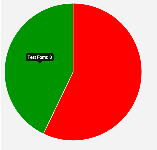
});With 4 lines of code (minus getting and preparing the data), you should have a functional pie chart that will show you how many of the last donations came from which form.
As you can see, I hovered over the pie chart and saw that my “Test Form” brought in three donations, while my “Another form” got four donations.
What Will You do with the Give API?
The data that you get back from the Give API is extensive. There are some awesome things you can probably do, especially when it comes to date-specific charts (donations between two days), as well as comparing donations month-per-month.
I am working on a plugin to showcase more charts I created. You can track my progress on the Github repo here. Included will be a shortcode integration so you can easily display the charts within your pages or posts for your visitors. Another great use case is to put them on a password-protected page, so only the right eyes can see your new chart — perhaps your board of trustees.
We would love to hear your ideas and thoughts on how you can marry Chart.js with the Give API and what uses and applications you’d like to do. Comment below with your ideas.
Amplify your fundraising with a GiveWP Plan
About the Author
Roy Sivan
Roy has been using WordPress since the early days. Nowadays he’s a senior software developer that specializes in WordPress at Disney. He’s also socially awkward, but he loves it when people say “Hi Roy!”