Why Should Donation Forms Never Have Pop-ups?
Pop-ups are a great way to drive traffic to the donation forms from other pages across your site, but what happens if you forget to disable them on the actual donation forms? You lose donors.

Pop-ups are a great way to drive traffic to the donation forms from other pages across your site, but what happens if you forget to disable them on the actual donation forms? You lose donors.
Even if your site-wide pop-up is an email subscription form, it shouldn’t appear on your donation form page. In fact, you should have as few distractions as possible on that page. When someone is about to give, the last thing you want is to interrupt them or direct them to another page.
The Donation Pop-up Nightmare
Picture this. You discovered a fundraiser you really want to give to. You’ve found the donation form and you’re just about to start entering your credit card info. A pop-up comes up with an advertisement.
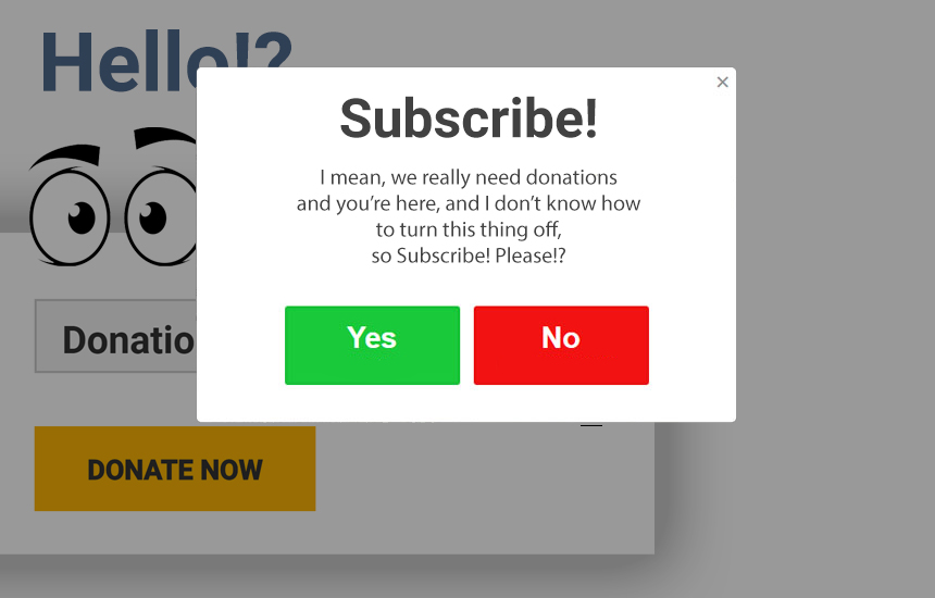
Annoyed, you click back into the form. You’re almost done filling it out, but you pause for a minute to double check your credit card number. Then, when you’re getting ready to click the “Donate” button, another pop-up enters your screen. It’s a form to subscribe to the email list.
This time the interruption causes you to simply close the whole page. Now you will save money by not giving. Plus, you won’t see those pesky pop-ups again.
Losing donors in this way happens much more often than it should. Even a single pop-up on your donation page will have a negative impact. The result is a low conversion rate and fewer donations.
Disable the Distractions and Get More Donors
The best thing to do is disable all pop-ups on your main donation form pages. Depending on how you’ve set them up, it’s relatively simple. Some plugins give you control over which pages display your pop-ups. Others make it harder to control.
It’s important to choose a good pop-up plugin that allows enough control to get your desired result. You might even consider one that helps you control what specific users see. This ensures you’re not asking the same person who already completed the action in the pop-up to do it again.
Once you’ve disabled the pop-ups, your donors will get a much smoother experience. A smoother experience means more donations. Completing a donation without any interruption is key to converting donors.
Drop All Other Donation Form Distractions
Pop-ups aren’t the only things that distract donors and keep them from donating. Many donation forms have too many “calls-to-action,” or things they’re asking the site visitor to do. For example, this page has an email signup and social media following widgets in the sidebar. They even have a pop-up on this same page with their donation form on it. There are far too many distractions and interruptions.
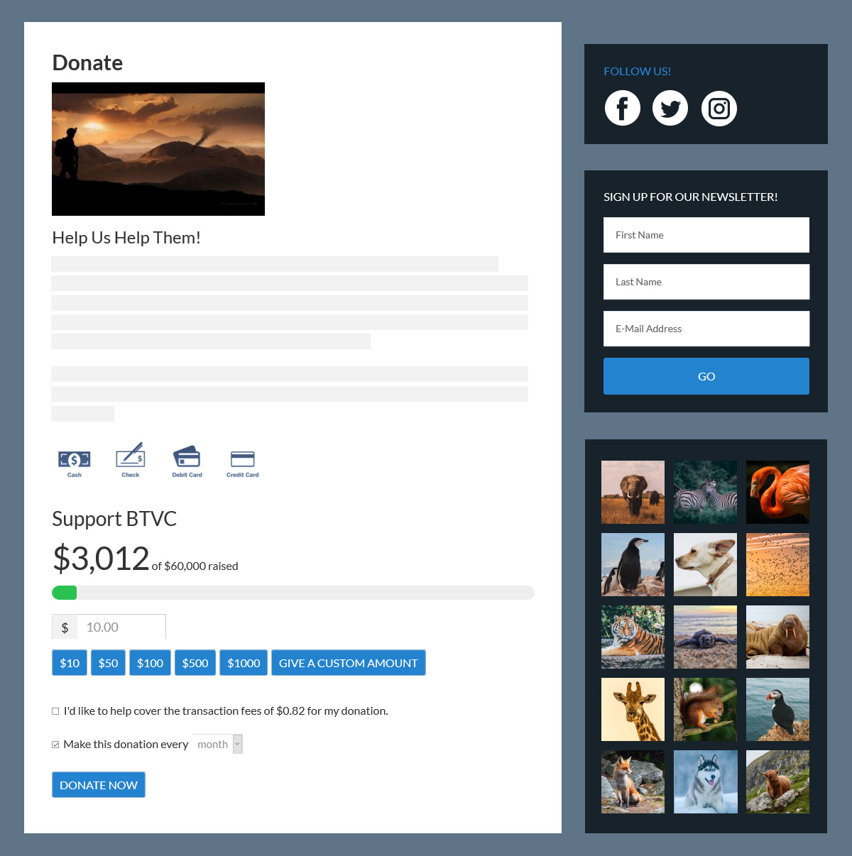
Get rid of all other calls-to-action. You might even consider removing your sidebar on that page altogether. The exception is if you’re using it to inspire donations on the same page. Whatever your decision, create as distraction-free of a donation environment as possible.
Now when donors land here, they can donate easily without distraction or interruption. However, your sidebar can be useful to drive more donations on your forms without distracting your donors. For more advice on how to use your Give Form Sidebar, check out this article called, “Don’t Let Your Sidebar Become a Sideshow Distraction.” Or you can watch this Two-Minute Tip from our Customer Success Team.
A Smooth Donation Experience
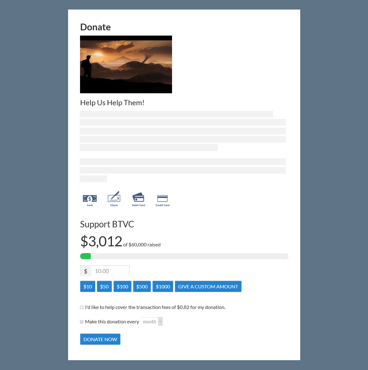
Let’s go back to our donation scenario. If you find yourself giving to an organization, which page would you rather land on? I’d choose the second one with no pop-up and no sidebar directing people off the page. As you fill out your information, your eyes aren’t drawn anywhere else on the screen. Nothing interrupts you and you can submit your donation within a minute.
This is the experience you want to give every donor, every time.
About the Author
Taylor Waldon
Taylor is the Director of Marketing for GiveWP, a WordCamp Speaker, and full-time RVer. She has a Master’s Degree in International Relations (concentrating in Global Conflict Development, Resolution, and Management). She’s an advocate for people with disabilities, a meme queen, and a dog-mom.