8 Common Donation Form Mistakes and How to Fix Them
Finding and fixing donation form mistakes will help you optimize your donor experience and increase online donations.
After creating an online donation form, you’ll need to see how it’s doing. After all, donation forms can strongly impact whether donors give, and you need donations to maintain your success as a nonprofit.
If your form is not optimized, you may find donors abandoning it more than they are giving, decreasing your online donations.
To increase form submissions and donations, look at these common donation form mistakes and how to fix them.
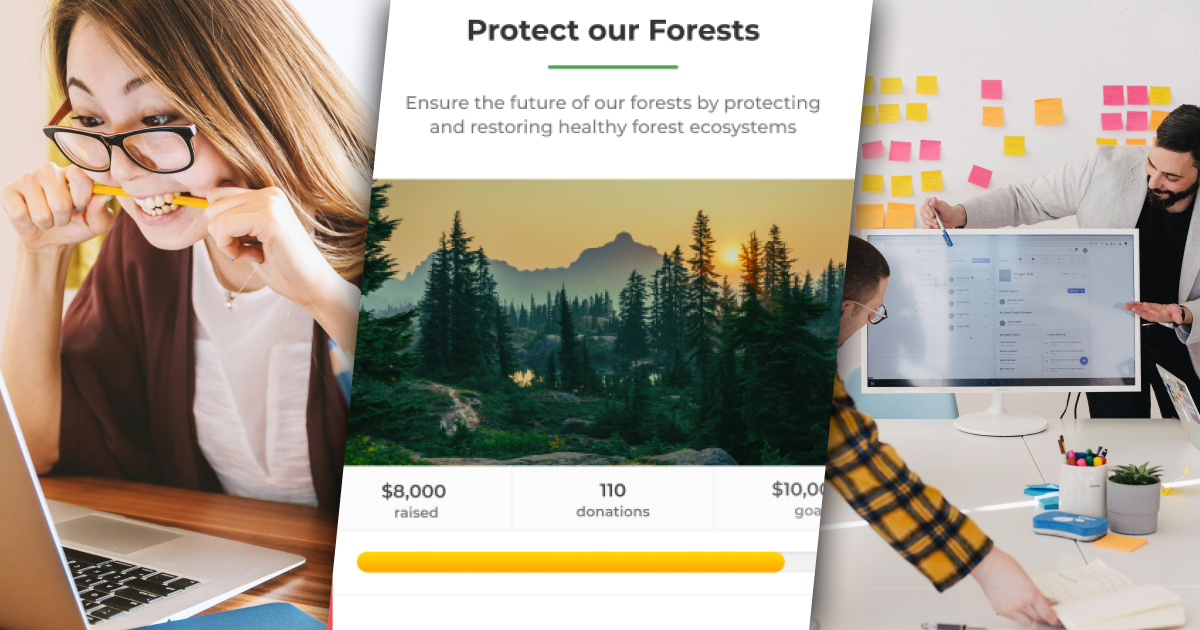
1. Being too Vague
Donors won’t automatically give as soon as they land on your donation form. They need to feel comfortable and inspired to give. But they can be turned away if you ask for donations without specifying what they’re for.
Remind them what they’re donating for. Provide details, be specific, add imagery, and reiterate your mission.
2. Not Making it Mobile-Friendly
Mobile giving is growing. In 2021, over a quarter of online donations were made using mobile devices. But not accounting for mobile users is still a common donation form mistake.
As the number of mobile users continues to rise, making your donation forms mobile-friendly is essential. Otherwise, your online donations could decrease.
Make sure your forms are visible and functional on desktop and mobile. Your digital fundraising platform should do this automatically. For example, all GiveWP forms are responsive and mobile-friendly.
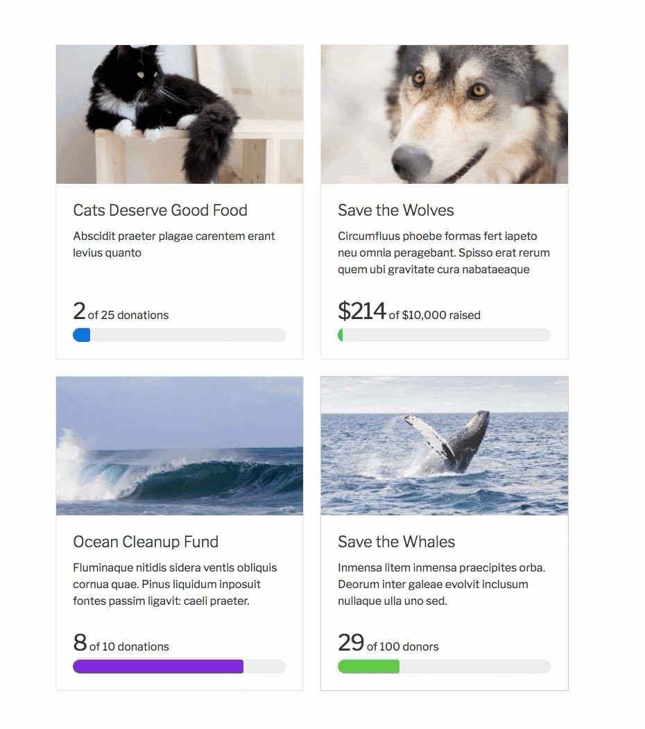
3. Not Organizing Your Forms
A common mistake for organizations with multiple donation forms is not organizing forms or making them hard to find. If people can’t figure out what to donate to and how to find it within a few clicks, they’re less likely to give.
Your forms should be easy to find on your website. Consider putting your donation form landing page in your mega menu or include a donation form on your homepage.
If you want to display your donation forms together, consider using the Form Grid Block from GiveWP. It neatly organizes your forms so donors can quickly decide which form to donate to.
4. Not Thanking Donors
Donors support your cause and organization. But when they’re not feeling appreciated, they may never donate again. Fortunately, thanking donors is an easy way to retain them and ultimately increase donations.
Donation forms allow you to do this automatically by showing a thank you page after receiving a donation. For example, the Multi-Step form builder includes a final page just for thanking donors.
On the other hand, redirect them to an extended thank you page. This page should be optimized with resources and more helpful information.
5. Too Many Distractions
All donation forms aim to obtain donations, so make giving easy with fewer distractions.
Don’t overload your forms or pages with multiple calls to action, and try to avoid popups or any other links that could take donors’ attention away. Focus on one call to action only: Donate.
You shouldn’t ask for too much information within your form, either. The more work someone has to do, the less likely they will follow through with a donation. Keep it as simple as a name and email address when possible.
6. Ignoring Accessibility
According to the World Health Organization, over 2.2 billion people have a vision impairment or blindness. If those two billion or more people can’t use your forms, they can’t give.
Your donation platform and forms should prioritize accessibility for all. For example, add alt text and captions to images and use strong contrast.
You can also try a platform like GiveWP for built-in accessibility. The default display method is accessible so your donors can give, no matter how they use the internet. This allows your donation possibilities to be open to all 2.2 billion of those users throughout the world. Don’t make the mistake of limiting your donor base with inaccessible forms.
7. Using Non-Branded Forms
Using forms that have weak or missing branding is a common donation form mistake. You should always ensure your branding is consistent. Effective branding and storytelling allow you to be seen as professional and trustworthy to potential donors.
If you use non-branded forms, this mistake could cost you donations. The form may be seen as suspicious if it’s not obviously associated with your organization.
Here’s what you can add or change to fit your brand with your donation platform or GiveWP:
- Colors
- Fonts
- Images
- Messaging
- Logo
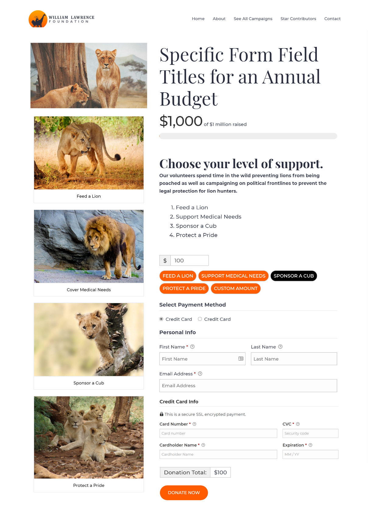
8. Confusing Payment Options
One of the worst donation mistakes to make is making payments confusing. Causing frustration to potential donors is an easy way to turn them away.
Here’s how to avoid this mistake and guide donors to the finish line:
- List one-time giving suggestions such as $10, $25, $50, or custom amount (with a limit).
- Provide an option for donation frequency or subscriptions to help increase recurring donors.
- Offer various payment options, like PayPal or Stripe, to remove friction from the donation process.
Enhance your donation forms with GiveWP
Finding and fixing these common donation form mistakes will help you optimize your donor experience and increase online donations.
To start creating optimized donation forms to boost conversions, try GiveWP. You can craft beautiful, customized donation forms. You can further enhance these forms to:
- Add and manage additional fields with Form Field Manager
- Allow donors to dedicate donations with Tributes
- Ask donors to cover payment processing fees with Fee Recovery
Amplify your fundraising with a GiveWP Plan
About the Author
Alexis Bryan
Alexis is a member of the content team at StellarWP. As a content marketing specialist, she enjoys writing, being creative, and working with the greater team on all things WordPress.