Form Grid Block
The GiveWP Form Grid Block provides a way to add a grid layout of multiple forms into posts and pages using the new WordPress editor. All of the configuration settings are built right into the block editor.
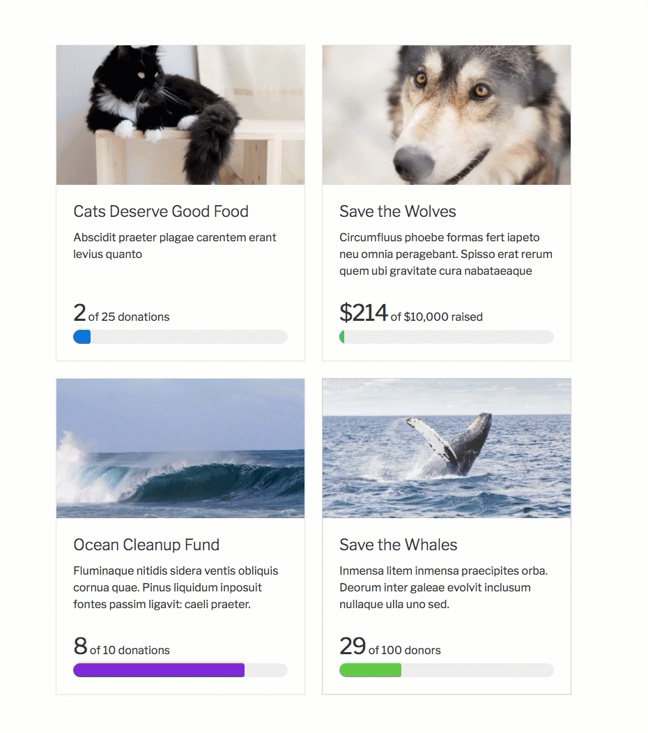
Say you would like a page to display a number of your site’s donation forms in a nice easy-to-see way. This will help your donors more clearly decide which form to donate to. This block can display a modal window donation form that pops up, or redirect your donors to that form page. Donation goals and featured images can be added to help convey the need for each form.
When the Form Grid block is selected all of the forms on the site will display within the block. Using the configuration settings will control which forms show and which do not.
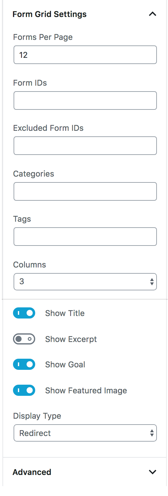
Block Settings
Forms Per Page
Settings Type: Text field
Default: 12
This setting controls the maximum amount of forms per page of the form grid. When the amount of forms is exceeded, pagination takes over and displays the forms across multiple pages. Page controls are added to the bottom of the form grid for donors.
Form IDs
Settings Type: Text field
Default: “All Forms”
Specify which forms to include based on their form ID. Form IDs can be found on the “All Forms” page by hovering over the “Copy Shortcode” link.
Excluded Form IDs
Settings Type: Text field
Default: empty
Use this field to include all forms except for those listed in this field by their form IDs.
Categories
Settings Type: Text field
Default: empty
Includes forms based on the form category they are associated with. This setting accepts a comma-separated list of category IDs. Category names and slugs are not currently supported. To learn more about form categories visit here.
Tags
Settings Type: Text field
Default: empty
Includes forms based on the tags that have been assigned. This setting accepts a comma-separated list of tag IDs. Tag names and slugs are not currently supported. To learn more about form tags visit here.
Note: To learn more about taxonomies within GiveWP, click here.
Columns
Settings Type: Select field
Options: Best Fit | 1 | 2 | 3 | 4
Default: Best Fit
This setting controls how many columns wide the form grid will be. Utilizing “Best Fit” will assign the number of columns best suited for the available space and form grid configuration.
Show Title
Settings Type: Toggle
Options: Enabled | Disabled
Default: Enabled
This setting either shows or hides the form titles.
Show Excerpt
Settings Type: Toggle
Options: Enabled | Disabled
Default: Enabled
Chooses whether to show the form excerpts. For more information on the form excerpts click here.
Show Goal
Settings Type: Toggle
Options: Enabled | Disabled
Default: Enabled
Controls whether or not the form goals are displayed. For more information on form goals click here.
Show Featured Image
Settings Type: Toggle
Options: Enabled | Disabled
Default: Enabled
Decide whether to show the featured image associated with the forms.
Display Type
Settings Type: Select field
Options: “Redirect” | “Modal”
Default: “Redirect”
Control whether selecting a form from the grid displays a modal window on the form grid page for your donors to process a donation, or if they are redirected to the forms URL page to complete their donation.
Advanced
Settings Type: Text field
Default: Empty
This is a default option for WordPress blocks that allow a user to pass a custom class so that it can be customized with CSS.


