Donor Wall Block
Displaying the success of your campaign is a great way to encourage potential donors to turn into real donors. One way to do that is with the GiveWP Donor Wall.
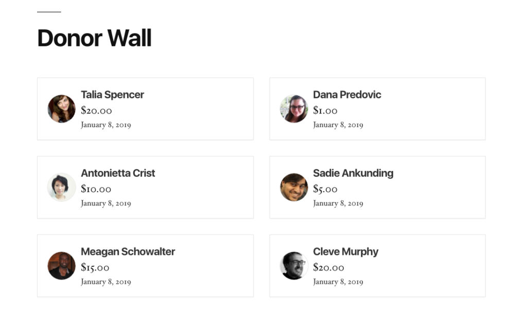
The Donor Wall displays up to 100 of your most recent donors, and their contributions. Enable the donor comment functionality for donor comments to appear on the Donor Wall. Donors who opt in to “Anonymous Donations” will not appear on the Donor Wall, and will not have the ability to leave comments.

Block Settings
These settings are found in the block settings panel when you have focused on the GiveWP Donor Wall block within the editor. Find out more about our GiveWP Blocks here.
Donors per page
Settings Type: Text field
Default: 12
This setting controls the number of donors you wish to show at one time. If the number of available donors exceeds that amount a “Load More” button will display giving donors the option to view more donors on the wall.
Form ID
Settings Type: Text field
Default: “All Forms”
Specify which donors to display based on the form ID they donated through. Form IDs can be found on the “All Forms” page by hovering over the “Copy Shortcode” link. Multiple forms can be included by separating them with a comma.
Order
Settings Type: Select field
Options: “Oldest to Newest” | “Newest to Oldest”
Default: “Oldest to Newest”
This setting controls whether the listed donors should be ordered from “Newest to Oldest” or “Oldest to Newest”.
Columns
Settings Type: Select field
Options: Best Fit | 1 | 2 | 3 | 4
Default: Best Fit
Controls how many columns wide the donor wall will be. Utilizing “Best Fit” will assign the number of columns best suited for the available space and the configuration of the donor wall based on current settings.
Show Avatar
Settings Type: Toggle
Options: Enabled | Disabled
Default: Enabled
Sets whether or not to display the avatar of the donor. By default the donors Gravatar is loaded if configured and made available by the donor. If no Gravatar is available an avatar with the letters of their first and last names is displayed.
Show Name
Settings Type: Toggle
Options: Enabled | Disabled
Default: Enabled
Decides whether to display the name of the donors that have given through the included form. Donors that have marked themselves as anonymous will not display on the form at all. To learn more about giving anonymously visit this link.
Show Total
Settings Type: Toggle
Options: Enabled | Disabled
Default: Enabled
Shows the total amount of the donation.
Show Time
Settings Type: Toggle
Options: Enabled | Disabled
Default: Enabled
Displays the date of when the donation was submitted.
Show Comments
Settings Type: Toggle
Options: Enabled | Disabled
Default: Enabled
Sets whether to display the comment the donor submitted along with their donation. If comments are enabled in your forms a text box will appear on the forms front-end. To learn more about donor comments click here.
Donor with Comments
Settings Type: Toggle
Options: Enabled | Disabled
Default: Disabled
This setting controls whether to only display donors that have submitted a donation with a comment. If the donor gave through the form, yet didn’t submit a comment, they will not be shown on the donor wall.
Comment Length
Settings Type: Text field
Default: 140
Controls the cutoff point in characters where the donor comment will provide an option to “Read more” rather than displaying the entire comment.
Read More Text
Settings Type: Text field
Default: “Read More”
This controls what text is displayed instead of the “Read more” option that displays when the character count of the comment is exceeded by the above setting.
Load More Text
Settings Type: Text field
Default: “Load More”
This controls what text is displayed inside the “Load More” button. This button displays when there are more available donors than what exceeds the “Donors Per Page” setting at the top of the block settings.
Advanced
Settings Type: Text field
Default: Empty
This is a default option for WordPress blocks that allow a user to pass a custom class so that it can be customized with CSS.
Examples using the Donor Wall Block
Here are some examples of how you can customize the Donor Wall in a variety of ways for different types of campaigns and use-cases.
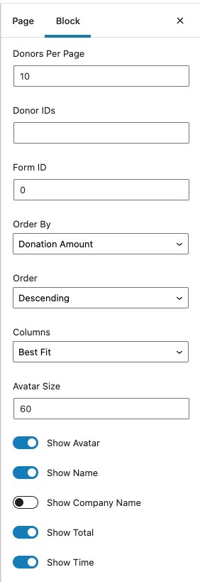
Sample Layout – Anonymous Giving
This example is great for an anonymous fundraiser. The Donor Wall only shows the amount given, the date, and is sorted to show the largest donations first. It hides images, names, and comments.
The first thing you need to do is switch the Order By field to Donation Amount and then use the following settings:
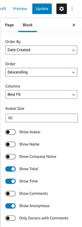
These settings will generate the following donor wall:
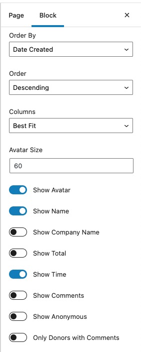
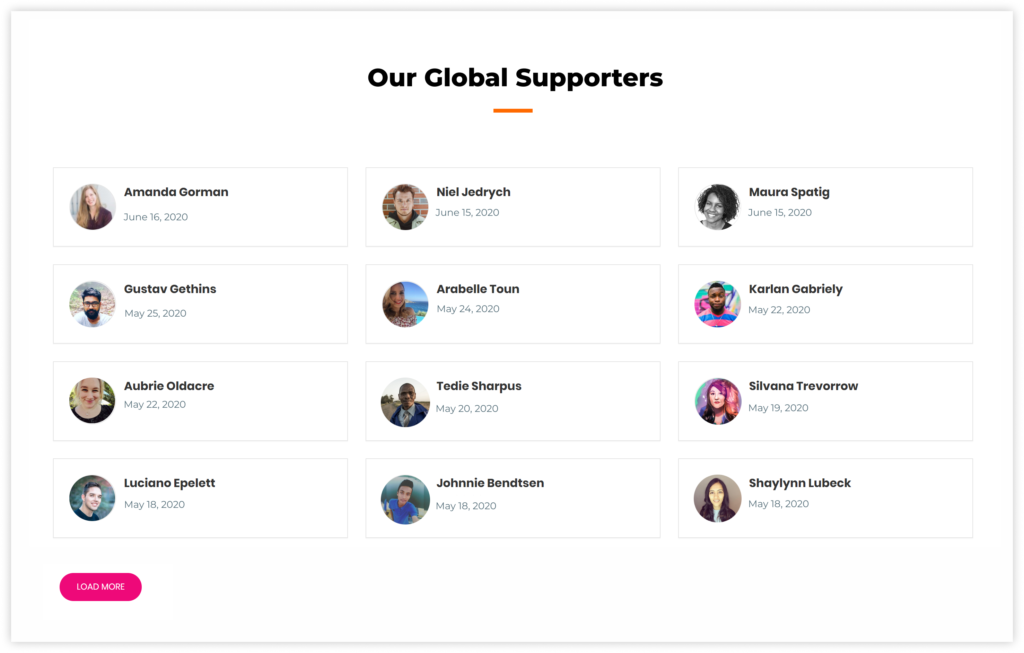
Sample Layout – Global Supporters
This example is good for when you have a lot of donors who have given and you want to highlight them, but not the amount they’ve given. This Donor Wall will show only their name, photo, and date. It has more columns and shows more donors per page. It hides the amount, any comments, and is organized by date.
The settings for this donor wall would look like the following:
The above settings will generate the following donor wall:
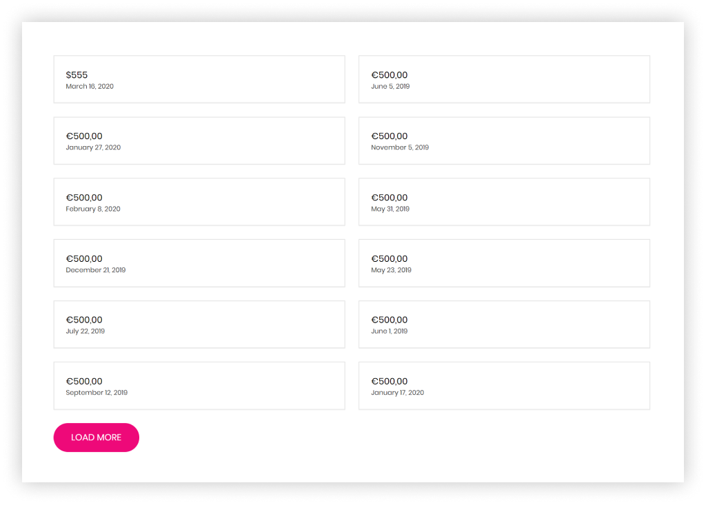
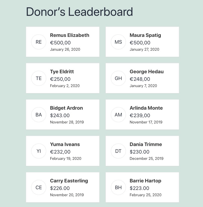
Sample Layout – Creating a Donation Leaderboard
This example is great for when you want to create a public leader board to display the largest donations you received on your site and their respective donors. The following donor wall will show the default fields, such as Name, Donation Amount and the Donation’s Date. The display will be in two columns and will show the top ten donors.
The settings for this donor wall would look like the following:
The above settings will generate the following donor wall:
All donor walls have a load more button that, in this case, you can hide with some custom CSS. The code to hide it would be something similar to this:
Hide the the load more button:
button.give-donor__load_more.give-button-with-loader {
    display: none;
    visibility: hidden;
}
If you need assistance in adding CSS to your site, GiveWP has documentation to explain how to do this – click here.
Frequently Asked Questions
- The Donor Wall is designed to display the donation date only. It does not currently support the display of hours and minutes.


