Editing GiveWP Forms
GiveWP includes two ways to edit donation forms: the Visual Donation Form Builder and the Option-Based Editor.
The Visual Donation Form Builder is the primary editing experience. It uses a visual, drag-and-drop block layout that gives users more control over the look and feel of their forms.
The Option-Based Editor is still supported for users who created forms before the Visual Builder was introduced. It offers a more traditional settings-based interface.
This article explains how both editors work and when to use each one.
Articles in this section:
 Visual Donation Form Builder Blocks
Where to Edit Forms
When you want to edit a form, you must do it through the Campaign using these steps:
- Go to GiveWP > Campaigns.
- Select the Campaign your form belongs to.
- Select the Form you want to edit.
The form will open in whichever editor it is using: Visual Donation Form Builder or Option-Based Editor.
Customizing Forms with the Visual Donation Form Builder
True to its name, the Visual Donation Form Builder offers a visual editing experience, so you can see what your form will look like while you’re customizing it. You’ll start by selecting a layout (which you can change later) and move on to design and building steps before publishing.
Choose a Form Layout
The Visual Donation Form Builder offers 3 layout options:
- Classic: This shows the full form in one page. It’s a good choice for short forms or donors who don’t like steps.
- Multi-step: This shows each section of the form on a separate step. It’s a good choice for longer forms.
- Two Panel: This is similar to the Multi-step layout, but it keeps the header on the left at all times in a two-column layout. It’s a good choice for forms that are used outside of a Campaign Page.
- You can see additional screenshots of these layout options here.
Select a layout and use the Proceed button to start editing your form.

Important: When using the Multi-step or Two Panel form layout, make sure your payment gateway section is the last section in the Build step. This is required so all applicable information can be validated and sent to the payment gateway for processing.
Design Your Form
The Design tab of the Visual Donation Form Builder is for changing the appearance of your form and is where you will land when you click to edit a donation form. You can use these options to make your form match your branding.

The following settings can be managed in the Design tab:
- Form Layout: Choose a different layout for your form. You can switch layouts seamlessly, and all content will automatically be converted.
- Header: Show or hide the header and individual header parts (heading, description, image. Change the Heading and Description text, and add a background image if desired.
- Donation Goal: Enable or disable the donation goal.
- Choose between the Campaign goal or the Custom goal. The Custom goal settings apply to the individual donation form vs all forms in the campaign.
- Custom goal settings are: Goal Type, Goal Amount, Goal Progress
- If you decide to hide the Header, know that your goal will be hidden on the form even if you have it enabled, as it’s part of the header section. You’ll still be able to track your goal in the campaign form’s admin pages.
- Choose between the Campaign goal or the Custom goal. The Custom goal settings apply to the individual donation form vs all forms in the campaign.
- Donation Button: You can change the text on the button in the Button Caption field.
- Styles: Choose to Inherit campaign Colors, or set your own Primary Color and Secondary Color settings for the donation form. A Header Image section is available to select an Overlay color and opacity if you’ve uploaded a Header image. And finally, a Custom Styles section to add CSS changes to match your brand colors. Learn more about how to identify CSS elements to change here.
Add a Header Image
To add an image to a Visual Donation Form Builder form, navigate to the form at GiveWP > Campaigns, then select the form in the Forms list to edit. On the right-hand side, there’s a section called Header. Select that to view the settings.
You can place the image at the top of your header, in the center of the header information, or use it as a background for your header. If you use it as a background, use the Header Image – Color and Opacity Overlay setting in the Styles tab to ensure your text can be seen over the background image.

Understanding Donation Goal Settings
When a new donation form is created, the Donation Goal is enabled by default with Campaign selected in the Form Goal setting. This means all successful donations from forms assigned to that campaign are included in the donation goal total.
To track donation goals for each form separately, change the setting to Custom. Once Custom is selected, additional donation goal options become available for configuration.
Learn more about campaign goals vs donation form goals here.
Edit Form Settings
When you’re happy with the way your form looks, you can switch to the Settings tab to configure settings for your entire form. These settings affect how your form functions, controlling things like the form URL and visibility, user registration, donation confirmation, and email templates.
In Settings, you’ll find the following:
- General: Change basic form details like the title, URL, visibility, excerpt, user registration, and where the form links to in the Form Grid.
- Donation Confirmation: Customize the text on the “Success Page”, otherwise known as the Donation Confirmation page donors see after successfully completing a donation, including header, description, tags, and redirect.
- Email Settings: Customize various email notifications sent to donors or admins in relation to donation transactions.
- Add-ons: Some add-ons, like Currency Switcher, add settings to this area as well. This is typically where you’d decide whether the add-on should use the global settings or custom settings specific to the form.
These settings are pretty self-explanatory, using basic text input or toggle options.
Build Your Form
The Visual Donation Form Builder uses blocks. A block is a form field, group of related form fields, or other content that you can add to sections on your form. Block settings are the settings that belong to a specific block inside the form. Settings for a block may include title and description settings, field labels, field placeholders, etc. Each block has its own settings.
The Donation Amount and Levels block, for example, contains block settings that include the field label, multi-level or fixed donation options, minimum and maximum custom donation limits, donation levels, and (if you use the Recurring Donations add-on) recurring donation settings.

Use Form Sections and Content
A section is a group of blocks (form fields and other content) on your form. Each section of your form has a title and description that you can edit.

You can add as many sections to your form as you want by dragging them into the form from the Layout section of the blocks menu.

Delete a section
When you want to delete a section, you can do so by selecting the section and choosing the Delete option from the 3-dot menu in the section tools.

You can also delete a section from the list view on the left side of the editor.

Add more content
Additionally, you can add blocks to your sections to add more text content. You can add as many blocks as you want to any section of your form by either dragging them from the blocks menu on the left side of the editor or by using the plus (+) symbol at the bottom of a section. The following section explains form field blocks and how to use them.
Add Form Fields
One of the simplest ways to customize your donation form is by adding form field blocks. To add a new field, click on the plus sign on a section and add a new block. Or, you can drag a new field in from the blocks menu on the left side of the editor. Learn more about Visual Donation Form Builder blocks.

Restrictions for adding form fields
These fields correspond to important donor or donation information that can only have one instance on your form. If they are already on your form, they will appear inactive in your blocks menu, and you cannot add them again.
- Donor Name
- Payment Gateways
- Donation Summary
- Donation Amount and Levels
Remove Form Fields
Just as you can add new form fields, you can also remove them. You can remove any field from your form by selecting the field block inside your form and choosing the Delete option from the 3-dot menu that appears in the block tools.

Restrictions for removing form fields
While you can remove any form field, some are required for the form to function. If you remove these fields, you will get a warning when you try to publish telling you to re-add them. The form cannot be published until you do.
- Donor Name
- Payment Gateways
- Donation Summary
- Donation Amount and Levels
Publishing Forms with the Visual Donation Form Builder
When you’re finished editing your form, and you want to publish it to your website, you can use the Publish button in the upper right of the editor. Alternatively, you can Save as Draft and come back to finish it later.

Frequently Asked Questions
Look for the URL field next to the site domain. This is where you can enter your preferred permalink.
Here’s what it looks like:
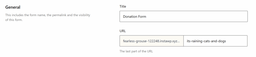
Tip: Keep permalinks short and relevant to your campaign for better readability and sharing.
Choose a Form Template
The “Form Template” tab allows you to choose the primary layout of your form. Learn more about Form Templates at the Form Template documentation.
Once you make your template choice, you can then choose various “Form Display” options.
Multi-Step Template Display Options
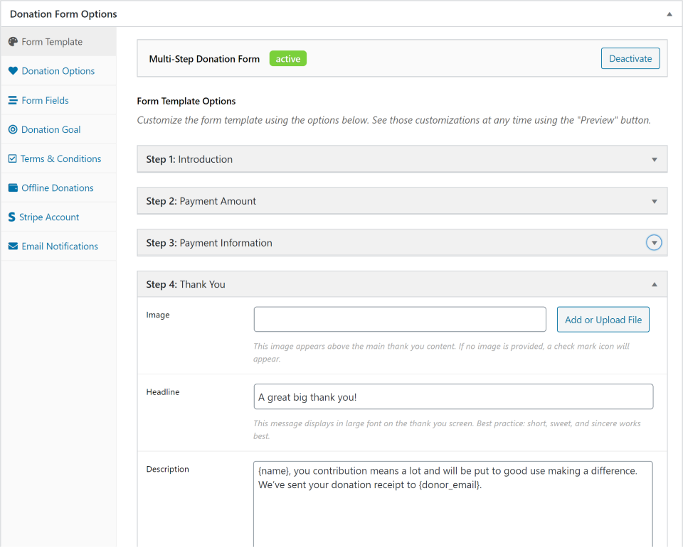
These options control the instructions your donors will see on each “step” of the form. The “Introduction”, “Payment Amount”, “Payment Information”, and “Thank You” represent each slide or “step” of the donation form for your donors.
Legacy Template Display Options
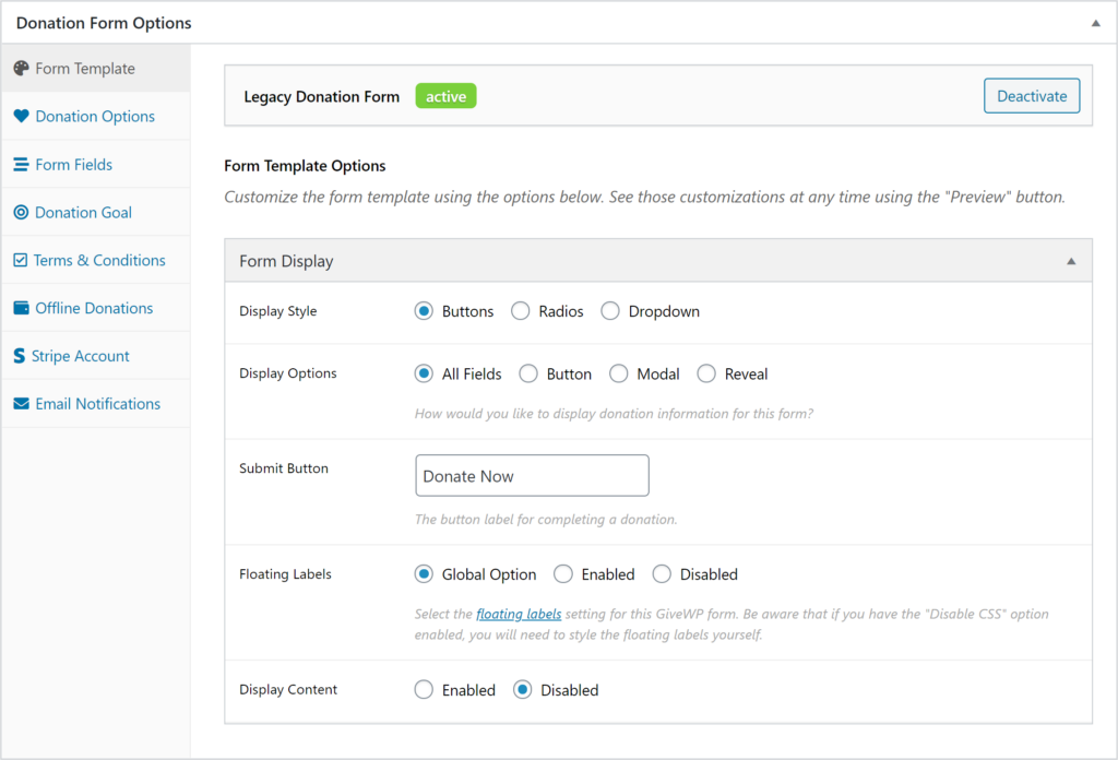
These settings control the general display of your legacy form. The display of the suggested donation levels, how the form fields appear, your form content and more are all here.
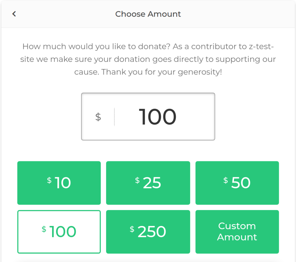
Set Donation Options
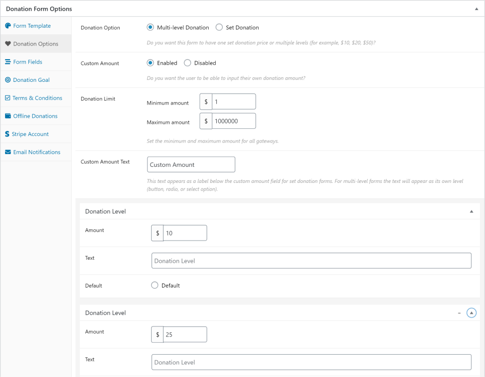
The “Donation Options” tab controls the various ways you present donation amounts to your donors. It controls the aspects of your form that have to do with the donation amount. Here you can set whether you want multiple donation suggestions or a set donation amount, whether custom amounts are allowed, and even minimum and maximum donation amounts.
Whether the multi-levels are displayed as buttons, radio buttons, or a drop-down is controlled in the “Form Template” tab.
Recommendations for minimum and maximum giving amounts are as follows:
$10 Minimum – Setting at least a $10 minimum is beneficial for two reasons. First, credit card donations have payment gateway fees which are costlier at smaller donation amounts. For example, 2.9% + $0.30 of a $5.00 donation is $0.45 total, which is 8.9% of the entire donation. That same rate for a $10 donation is already only 5.9% of that donation, and only 4.1% of a $25 donation. Being smart about your minimum donation amount is recommended.
Additionally, a higher minimum helps prevent against credit card SPAM attempts. Credit Card thieves will often test credit card numbers they’ve stolen on online forms that have low or no minimum amounts. Forcing a minimum helps prevent that. Read more about how GiveWP can help you prevent that on your forms here.
Regarding maximum amounts, you also want to consider how drastically the credit card fees will impact that donation. For example, if a donor wants to donate $5,000, while the total percent taken out is low it still represents $145.30 which could go to your cause instead. Add language above your form requesting that donors who want to donate more than $1,000 use your Offline Donations gateway to mail checks instead.
Configure Form Fields
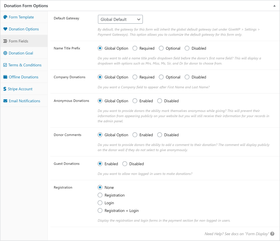
The “Form Fields” tab controls some additional fields and the appearance of the fields within your form. Here you can your payment gateway defaults (separately from the global settings), whether to use name prefixes, enable Company fields, anonymous donations, and control whether your donors register for a user account or not.
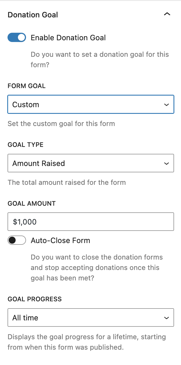
Add a Donation Goal
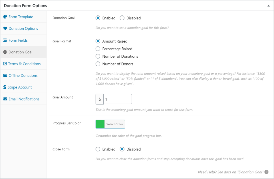
The Donation Goal tab allows you to enable a goal and progress bar for your form. Control the goal amount, goal type (percent, donations, donation amount, or recurring donors), the color of the progress bar, and whether you want the form to be closed or not when the goal is achieved. This feature also pairs nicely with the free Form Countdown add-on.
Create Terms & Conditions
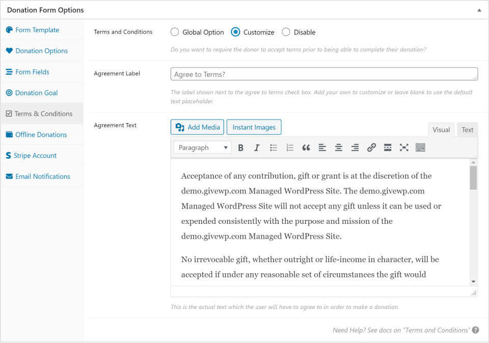
This tab allows you to enable a “Terms and Conditions” that your donors must indicate acceptance of via a checkbox. There is a global setting for this, so you can choose to have your form inherit the global terms content, or customize it for this specific form. The terms who write will be available to be viewed on the form via an animated expanded section so you don’t move your donors away from the donation page in order to accept the terms.
Customize Offline Donations
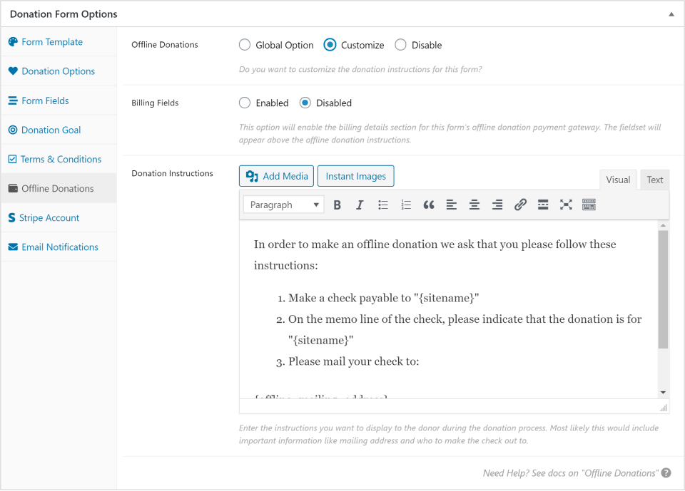
If you have enabled Offline Donations in your global settings, then this tab will appear. This allows you to customize the Offline Donations instructions per form.
An example of why you might do that is perhaps you most often want to encourage donors to use Offline Donations to mail checks; so your global Offline instructions are about how to mail checks. But you have one form that is for a local canned food drive. You can have donors give monetary donations, but you can also customize your Offline Donations instructions for this form to explain how to drop-off canned goods donations.
Select a Stripe Account
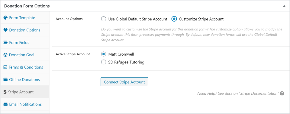
If you have the Stripe gateway enabled (either the free version or the paid add-on), then this tab will appear. This allows you to designate which connected Stripe account you want to use for this form.
Setting this to “Use Global Default Stripe Account” will set this form to use the default Stripe account set in your global Stripe payment gateway settings. Choosing “Customize Stripe Account” will let you chose which of the available connected Stripe accounts you want to use for this specific form.
Keep in mind that if you want to add additional Stripe accounts, you’ll need to do that from the global Stripe settings page.
Customize Email Notifications
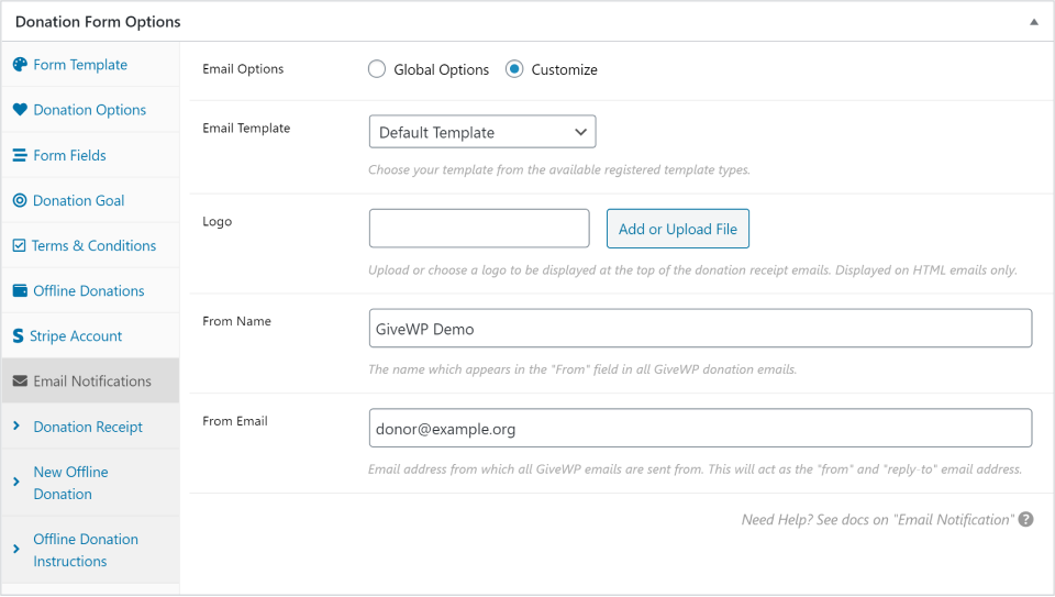
This tab allows you to customize the messaging of each of your email notifications per-form.
These are all set globally in the email settings, but you can enable customization of each of the following emails:
Admin Notification (the one sent to your organization as a notification)
Donation Receipt (the one that goes to the donor upon successful donation)
New Offline Donation (only visible if “Offline Donations” gateway is enabled. This is sent to your organization as a notification)
Offline Donation Instructions (only visible if “Offline Donations” gateway is enabled. This is sent to the donor)
The Multi-Step form template only supports external links that are set to open in a new tab/window. The form itself displays in an iframe (essentially a page within the page) and part of the security of the iframe is a setting preventing the display of anything that does not originate from the same site. So an external link will be blocked.
This also goes hand in hand with fundraising best practice: once a donor is reading your donation form, the best possible outcome is a donation. Don’t distract from that by directing them elsewhere with a link.
If you must add a link to any of the steps of a Multi-Step form template (including terms and conditions), set it to open in a new tab by adding target="blank" rel="noopener" to the link. A fully-formed HTML link set to open in a new tab looks like this: <a href="https://example.com" target="_blank" rel="noopener">My Example Link</a>
To enable this setting:
1. Edit the desired donation form.
2. Open the Settings tab.
3. Scroll to the Donation Confirmation section.
4. Enable Confirmation Page Redirect.
Once enabled, donors are redirected to the page set as the Donation Success Page in GiveWP > Settings > General.
Tip: Updating the Donation Success Page changes the destination for all forms using this redirect setting.
1. First name
2. Email address
3. Donation Amount
That is all that is required from the donor. Other form fields such as a billing address, company name, etc are completely optional (unless required by a specific payment gateway).
.root-data-givewp-embed {
width: 100%;
}
The above CSS goes wherever you currently add custom CSS to your theme. The CSS won’t work if you put it in a GiveWP form, or in the GiveWP global CSS at GiveWP >> Settings >>Advanced >> Donation Forms.
Please note: This is a visual fix only. If a form is not displaying because of a Fatal/Critical Error, please reach out to your host for the PHP error log. A form crash should be logged there. When reaching out to GiveWP support, please ensure to include both the site’s System Info and the PHP error log. If you don’t know how to get to the PHP error logs you can ask your host where to find the PHP error logs on the server, then attach the file to your reply, or if you know how to find it: copy/paste the relevant fatal error into your reply.


